
Panorama of the Timothy Ely retrospective LINE OF SIGHT at the Northwest Museum of Arts and Culture in Spokane.
It began with a question of ‘’How large should I make my book?’’ My student felt the question absurd but really there are no absurd questions. I told her of many successful experiences and missteps with scale. 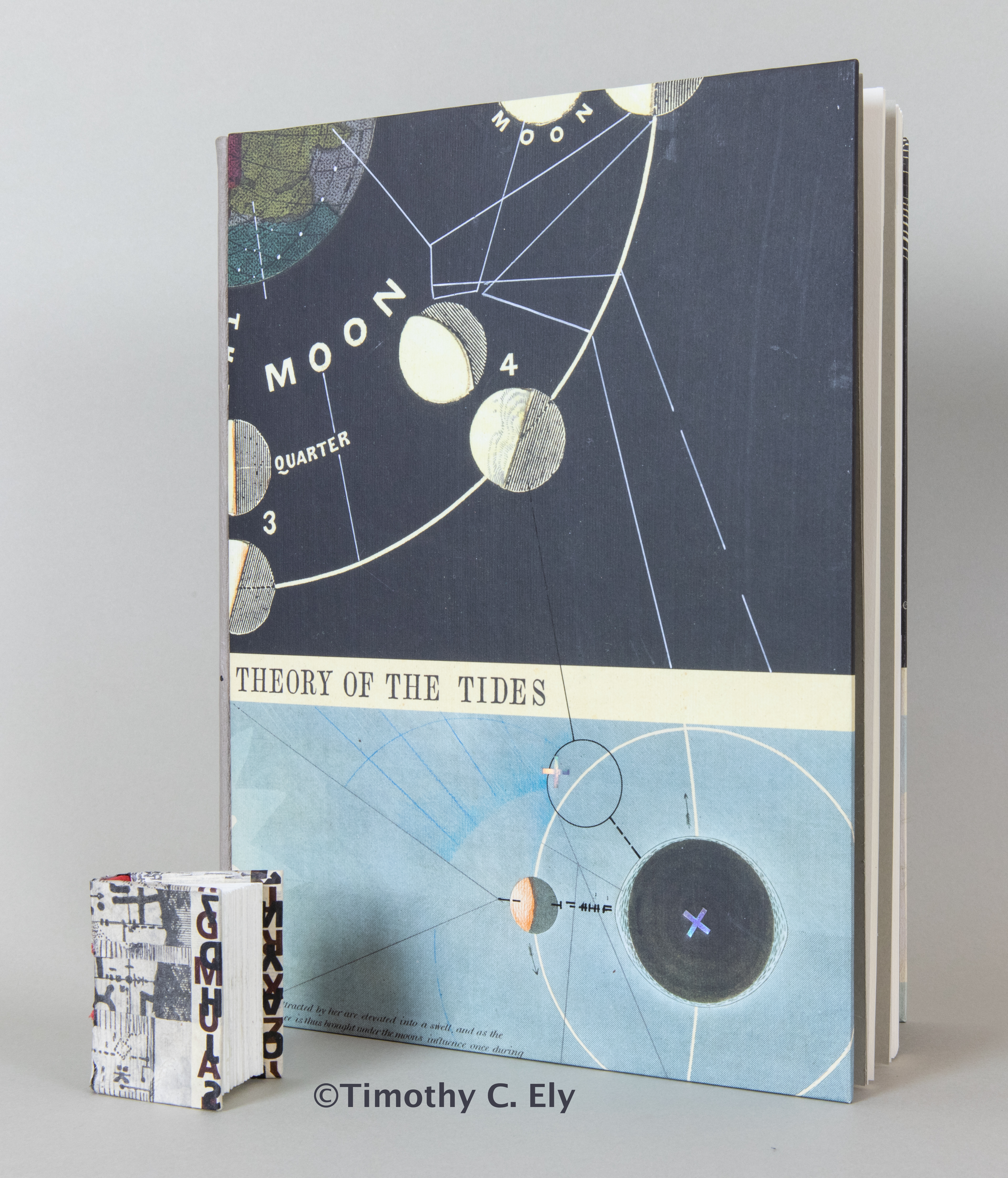 What does it mean to make something of any size?
We were specifically referring to sketchbooks and I have reasons for why my preferred size works. Many are practical while not a few are eccentric… like how mine all are designed to fit a set of shelves.
A question of scaling to a smaller or larger size is like the problem of doubling or tripling a recipe without taking into account changes in quantity, time and temperature. I once messed up when cooking rice for 50 people by not respecting that even a simple recipe doesn’t merely “scale.” Just multiplying outward without regards for temperature and mass is a way to derail any project. It also baffles the mind to attempt to cook a tablespoon of rice.
My Encounter with Scale Started in Art School
In 1970 I was given an assignment in an Inventive Drawing Class [WWU, w/ R.Allen Jensen] to make something “with regard to scale.” It was a vague and abstruse problem and naturally could only possess a provisional solution. (It’s school!) I decided that I would work very large as my usual impulse was to work minutely.
 I settled on a huge ball of twine from the barn and started with a door knob in the art building. I made a drawing using twine and charcoal that followed the twine out of the building, across a corner of campus. It circumnavigated the science building twice and terminated near humanities (I believe). My twine was laid down as a quick sketch — a gesture really — because the world on which the drawing happened was inhabited. Charcoal was used to create an utterly fake secondary system — adding a layer of mystery with material which would wash away in the rain that was a few hours out. It was also an interesting way to meet people.
I made the piece in about an hour just before the class convened then I urged everyone to follow the twine and follow my logic — perhaps to muse on why it was twice around the sciences. What came away for me, besides the essential silliness of the action, was how it felt in the body to work at that scale. This was a different experience than say, engraving on a small copper plate. This felt like a surveying exploration, aligning my twine with sight lines and points. I took advantage of things like fire hydrants and other ornaments on which I could make a hitch and carry on the drawings.
As quickly as we finished, maintenance decided this was a prank and not high art. They gathered up parts of it and the twine was never returned.
Spring quarter, around the same time on Sundays, my friend Simonson and I began to make giant snap line drawings in empty parking lots. The lot for my dad’s hardware store was around a hundred feet on the long edge and chalk lines in black, blue and red gave us a matrix. These were magnificent and we started looking for larger parking lots. Part of the process was to make polaroids of the drawings and if possible observe the effects of rain on the work. The photos are probably in Simonson’s archive.
Perceptions of Scale
As I explored scale, I encountered a first consideration of relationships and distance — especially between the artwork and the observer.
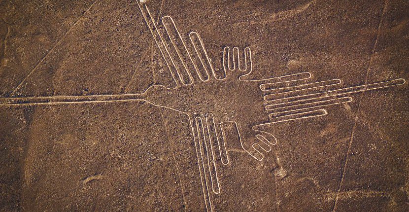 The Nazca Lines in Peru are best seen from a place of altitude [or Google Earth]. The abstractions that Simonson and I drew fell apart when viewed with insufficient distance. Weird because the while lines were thin the compositions very large — hard to view at a distance [spooky] and delicate up close, but challenging to gather the entire concept.
As I began to notice how I was attracted to line qualities, I found also that this sense was directly influenced by where the line was in relation to my own optical equipment. A delicate line on an engraved plate or rough pastel at the same distance reads differently and carries information differently. From across a crowded room, those distinctions begin to flatten out or vanish altogether.
This is grounded in perception — the why and how of our ability to see. I had a fondness for Frank Stella’s Protractor series but until I saw one in real life (as opposed to a picture or post card) I was unaware that the canvas was unsized and unprimed, that the ‘protractions’ were beautifully penciled in and the paint was carefully applied right up to that pencil line. There was no sign of elaborate masking with tape — just a skilled hand. The tiny scale of a gallery ad or other image completely defeated establishing an honest perception of the work and an authentic experience revealed so much more.
An image in a book beheld at almost arms length requires a level of definition not demanded when an image is twenty feet away.
Scale and Material
 A second revelation, about materials and construction, started to dawn around the same time. It starts simply — by observing that a full sheet of thin plywood essentially collapses under its own weight. It is, if walked on over a space, very bouncy and thin. And, yet, a small piece about six inches square is very rigid. I don’t recall when I became conscious of this phenomena, but it was to be relevant to the making of books. I probably sensed this earlier when my friends and I were hip to the idea that if you are going to scale a wall or mountain, the rope needed to be thick enough to hold you — string was not going to do it. [I should note that I only went climbing once.]
Consider a similar reality for books where we build with thick paper and thin paper.
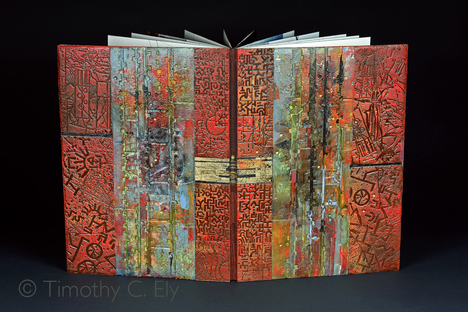
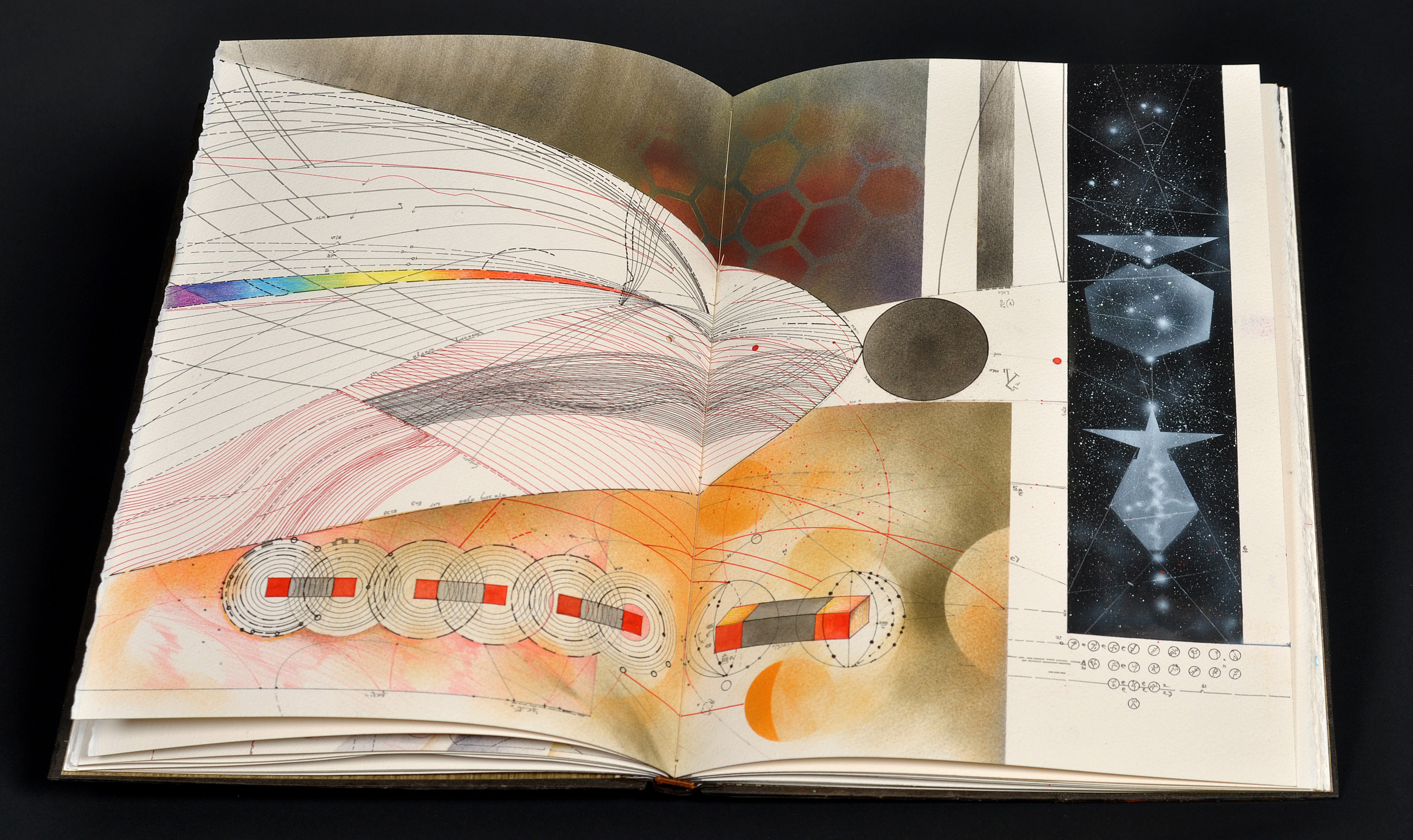 My favorite book size is one that fits from the fold of my fingers to the elbow. At this scale, my favorite material for folios is usually a half sheet of Arches cover. A full 0.018 inches thick, this half sheet has enough drape to not feel like a rigid leaf.
My books are usually self-commissioned or, if not, I have control over the final parameters governing the size. My relationship with a favored paper of consistent caliper thickness directly affects my choice of scale. This is relevant to the primary question which generated this post. Just how big?
In my work I spend a lot of time digging into the rationale for why something is done. During my UK time, often I was told something was just done that way. To me, that is a sloppy way to run a railroad.
Scale and Commercial Binders Board
 Since its insertion into the scheme of technology, commercial binders board has had a rangy set of qualities from surface to thickness. Sometimes wonderful and other times it’s a dog’s breakfast. It is such a common material now I often wonder why someone would use expensive elegant leather over recycled cartonage. I cringe when I see raw board laced on and about to be covered in leather. I prefer to customize the board in order to make it optimal.
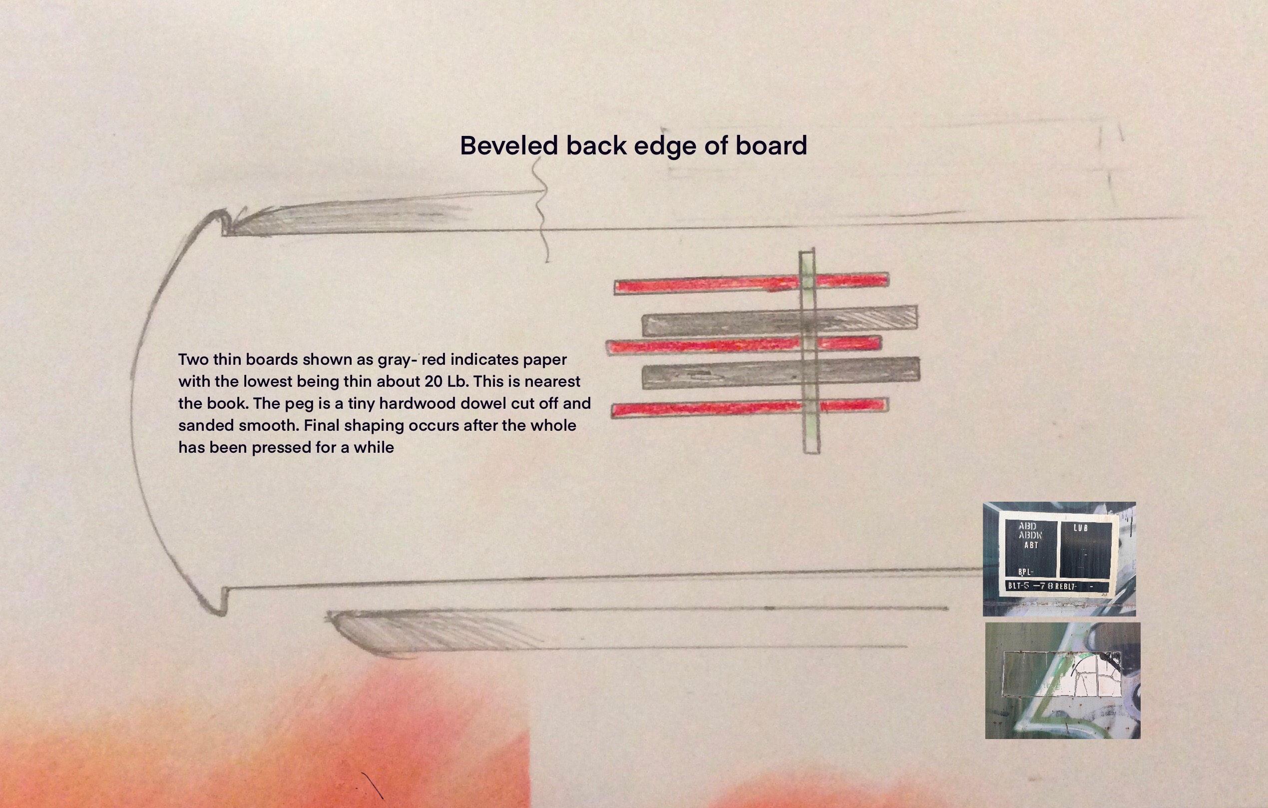
I use the thinnest board I can buy, laminate it to the imagined correct caliper, surface it with paper, peg it for stability and sand it to an elegant surface. It ends up like illustration board with a kid finish.
My boards are made to a scale which suits the book. Exactly what this means is a bit arbitrary (or a lot arbitrary). I am after a board which, when covered with leather [a strong force pull] or a collage of pigments and other raw material [weak force], is still affected by the coefficient of expansion and contraction. We live in a world of compression and tension.
Paper covering choices also affect the pull of the board. We know that THIN ALWAYS PULLS THICK. So a thin paper is used with paste on the inside of the board and a thick print or watercolor paper is used on the outside. On occasion, the boards I use are cut to size and the paper is wrapped and carefully mitered. I make certain all of this spends maybe a week under great pressure.
Fitting Boards to Scale
I was [erroneously?] taught that one would select a thickness of board and that thickness determined the height of the shoulders, formed as such by hammering a freshly glued, squared up and rounded book. I like the concept of this shoulder but in no way do I approve of really tall shoulders on, say, a quarto sized book. I design, instead, a small elegant shoulder which gives me a bit of piping at the shoulder when using leather and the board can fit elegantly up to it. This means of course that the board must be chamfered down [beveled] in order to get this elegant fit. Since my boards are beveled so to achieve an illusion of streamlining, it’s all good. I want the shoulder to form a foundation for measurement— – everything is built out from that area and I want the fulcrum effect of the shoulder. Like a classic Stratocaster — it need be near perfection.
The scale of the parts as they come together is important for the overall gestalt of the binding. This resembles an organic process — in the best case a serial growth. [In the worst case, it’s overwhelming — a drowning?]
 So even at my typical scale, the make-up of the boards needs to be the right size. That size is derived from a developed intuitive sense as well as conversations with other binders. If you look at the bindings that really move you, the game is revealed. A history with looking at books also helps.
Yet any tour of a bookstore will also reveal small things like pocket dictionaries and phrase books. These are often made up of very thin paper and the books work – the pages turn nicely. Content and quantity drives the larger dictionaries to also have thinner paper — mine fits much of a language into a book of some 1500 pages.
A few years ago I made three books on the theme of ‘the second road.’ Only one of the books made the cut to actualization as I was not satisfied with the drawings in the rest.
The one finished work was drawn, like my other work, on Arches Cover. But the book was created at a more modest scale — about three inches square when closed. It was assembled using my usual approaches only to discover that the stiffness of what is very thick paper at this scale caused the board to lever away from the endpaper. This necessitated a mend and minor change of structure. Endpapers were drummed to  the first leaves and, thus, the thick paper ended up twice as thick — all in a very small area.
Small Works from David Sellars
My teacher, David Sellars, made an unknown number of small bindings and I ever only saw two. What I so admired about David’s thinking for these works is that he focused, first and foremost, on the scale of the tiny things.
At this scale, he made his boards from laminated paper. Everything was scaled and shaped; his two-tier endbands were made from deconstructed thread to get all the sizes right. Paring leather from the skins of younger goats gave him the right thickness for the size. And, in the end, these little books felt just like his standard issue bindings — as if they had been hit with the shrink ray.
Just because it was small did not mean giving up the lovely conventions that make up a fine binding. So it was all there. I believe that if David had chosen to make a small model car, his would have run.
Yet many miniature books that I see lack the considerations David delivered. David’s books looked like very small, fine leather bindings. They were elegant to see and hold. Far too often in catalogs of collections we see thick square boards, clunky, overlarge tooling and lettering that is just wrong. The scale between the working parts is dissonant. It is worth remembering we cannot use the same materials and tools to make a small book and have it still feel proportionally like books of a conventional scale.
Similar realities develop in the other direction.
One of my earliest books was 24 inches high, an Atlas, a lovely large beast of probably 15 sections and covered in black leather. It was made as a donation for a fund raiser. Before delivery I decided to make the rounds of some Seattle galleries and see what would occur.
I found little traction that day and many astonished reactions. Relevant to scale, the boxed book was a monster to carry and a delight to see only IF there was a table in the gallery. (A couple galleries simply could not view it.)
After lugging it around on a hot day, I learned another truth about books and scale. If a book did not fit under my arm, transport was awkward. Even more, after long careful looks, the scale of the drawings was not enhanced by making them larger than what would become my final favorite scale.
 My Scale of Most Comfort
The middle path for me, and one that is most cinematic without becoming Godzilla, is the scale I described above — giving me a book that is about 15 inches high. Naturally a paper change which affects thickness [one aspect of scale] can, and does, result in a different register of the movement and dynamics of a book. So I have the best luck remaining on the path of my favorite paper.
Whitman College, 2004
When I move outward from the book, I am fond of large drawings on half or full sheets of arches cover. My favorite large size is 40” x 30” — giving me a chance to work from the shoulder rather than arcs from the wrist.

Whitman College, 2004
Fortunately, when I am working at this large drawing scale my small, pointy, sharp precision instruments can remain at play. Other tools start to work their way in as well. Ruling pens scale up to turkey basters and squeeze bottles or even hardware store spray bottles filled with India ink or dye. We begin to leave the intimacy of the art shop to the more construction grade effects of the hardware store. Brushes used for applying wall paper paste easily come into play.
Into Much Larger Scale
For liberation in both physical work and thinking, I make murals. I have not made many but each time it brings the body into play along with a vast change of mind. Walls directly worked on have built-in noise factors. They are not smooth so a line, now much wider than usual for me, is also fractured by the irregularities of the plane. At this scale, I must also be able to read the drawing from across a crowded room.
I have made three murals on the wall that are worth noting here. In 2004 I had a fine show at Whitman College. Gallery director and curator Ian Boyden surrounded one of my large glass sculptures [yet another story] in a black room with white sand on the floor. I drew into the sand and on all four outer sides of this near cubical room.
From that drawing came the job to create the mural for the offices of

Atomic Direct, 2005
Atomic Direct, an advertising agency. By this time I had fallen for pastels, dry pigment and extruded acrylic paints as a great vehicle for the work. The mural was confined by the placement of the windows so I settled on a notion of concentric circles. One pin gives you a circle, two gives you an ellipse and three can take you off planet or make a descending spiral.
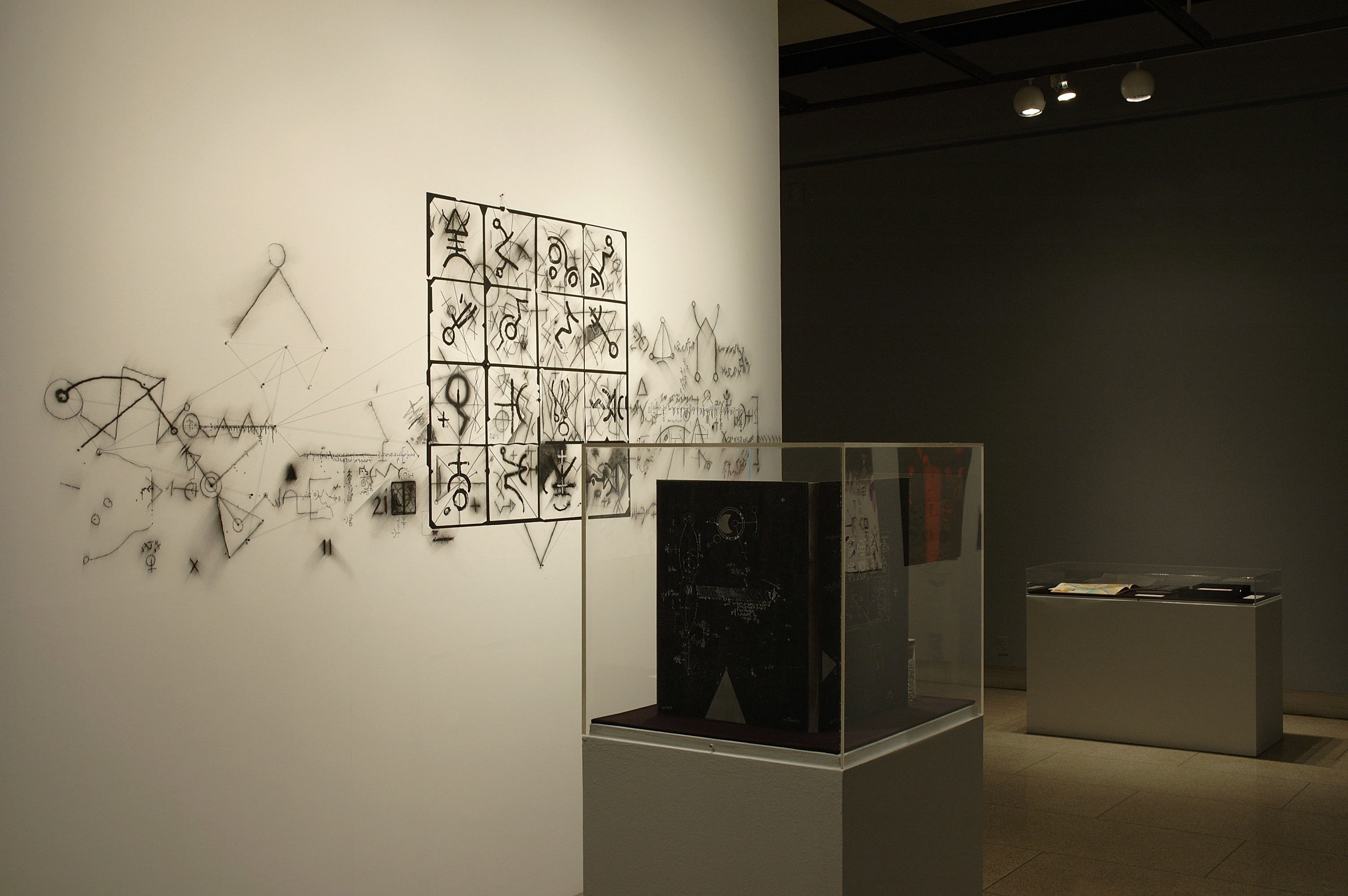
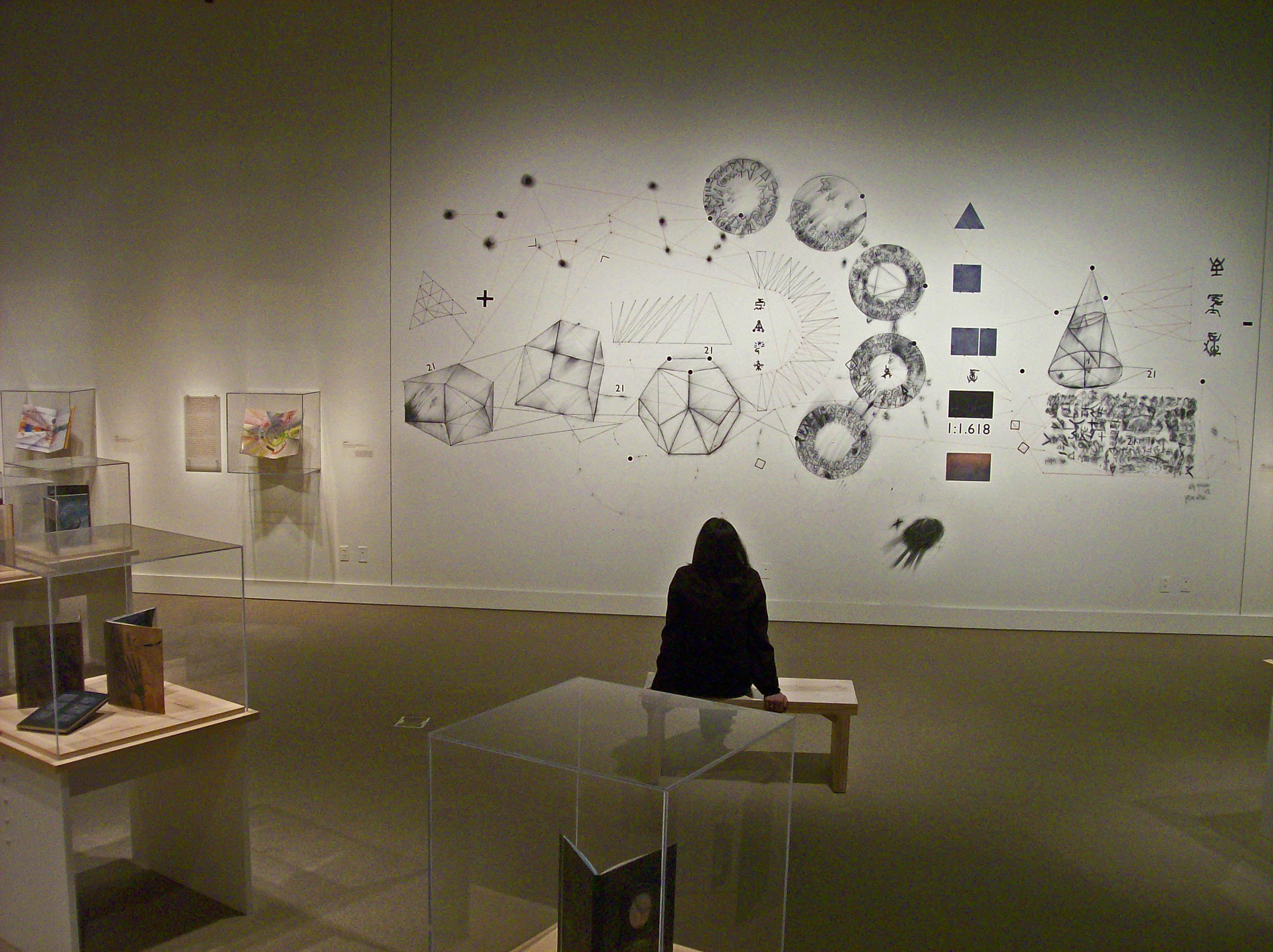
The Line of Sight exhibition at the Northwest Museum of Arts and Culture (Spokane, WA) in 2010 featured another mural. This show contained 40 books — all at my most favored scale. I also exhibited 3 full sized drawings. Horizontal in format, they helped the uninitiated deal with seeing books in an exhibition space.
Atomic Direct, 2005
As we were laying out the room, placing the cases for the books, a long wall space revealed itself. It was quickly decided I should make a very large mural. I am very fond of how ideas can appear instantly — from nowhere and “no-why” — with such speed. It is uncanny. The space was already very interesting to me as the cases holding the books were arranged in concentric circles. It was beautiful.
The sketches for the wall came quickly and its 12 x 20 foot proportions are nearly a golden ratio (which, in case you forgot, is 1:1.618).
Line of Sight, Spokane, 2012
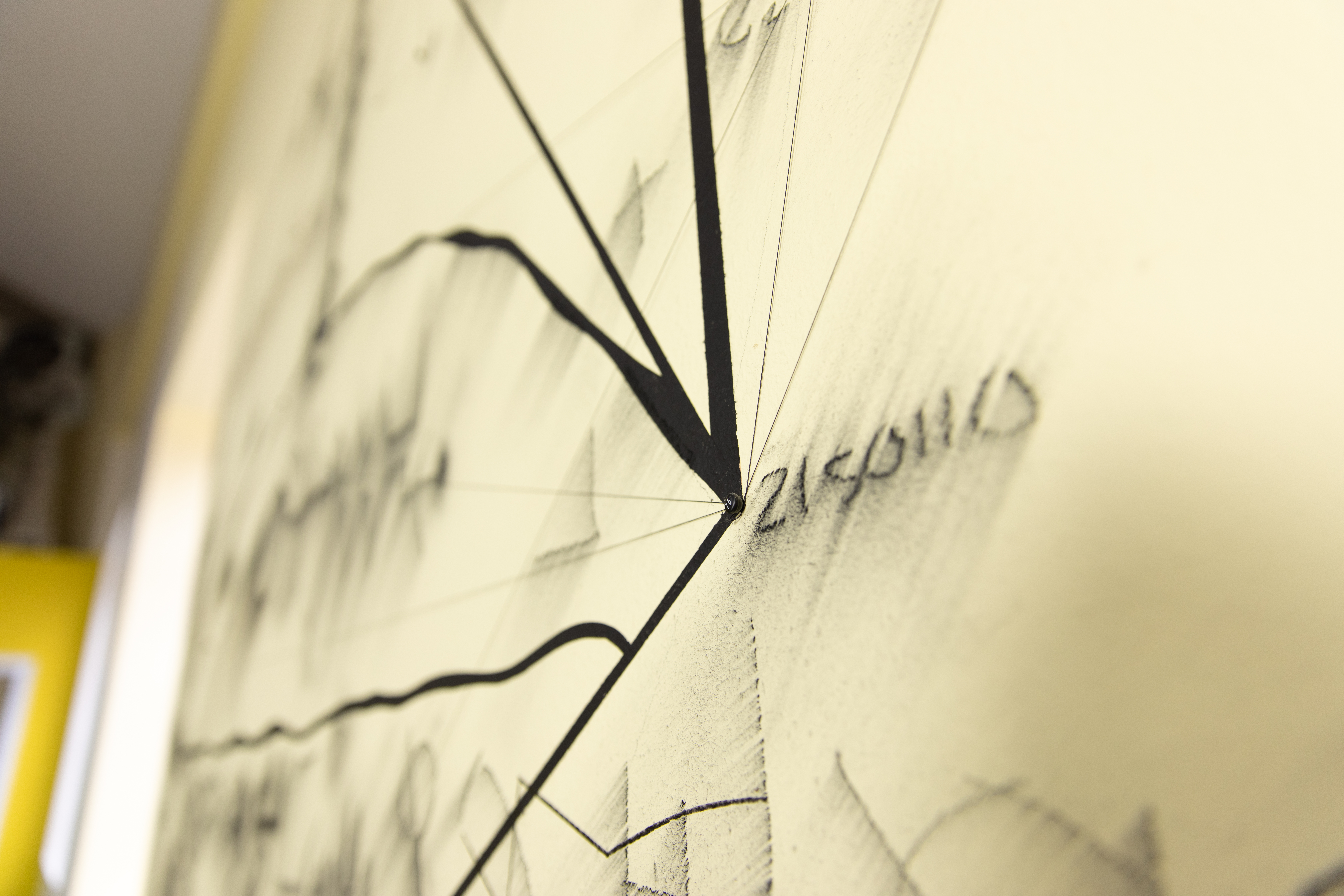
In order to create this large work, I made several polygonal drawings and templates for projecting then designed custom vinyl lettering [non English]. My friend Randall Hankins also cut Cribriform shapes out of steel which I fixed to the wall with roofing screws and bullet magnets.
Over the pastel forms, constellations were created using another spiffy type of nail. Black surgical thread tied from point to point made a gorgeous tight line which set the grids and patterns off. Shadows were an unexpected side effect from this way of making and the scale made it a web of conceptual difficulties. With the inherent ambiguities, what was one to make of it all?
Time is Scale

Line of Sight, Spokane, 2012
I have not done this for a while now, but I love the conditions that time and rain play with some of the temporal
configurations I have made on the beaches of Oregon. When we lived in Portland, we would often vacate to the coast in the winter and the beaches were largely devoid of folk. Perfect! My wife Ann and I would grab a stick and make massive drawings — barely visible and soon to be removed by the tide. Never photographed ever.
On the scale of time, some books may well last a thousand years and a drawing on a beach only a few hours. Exhibits end and fortunes change. The Atomic Direct office has moved and that mural was painted out. The other murals certainly went the way of the
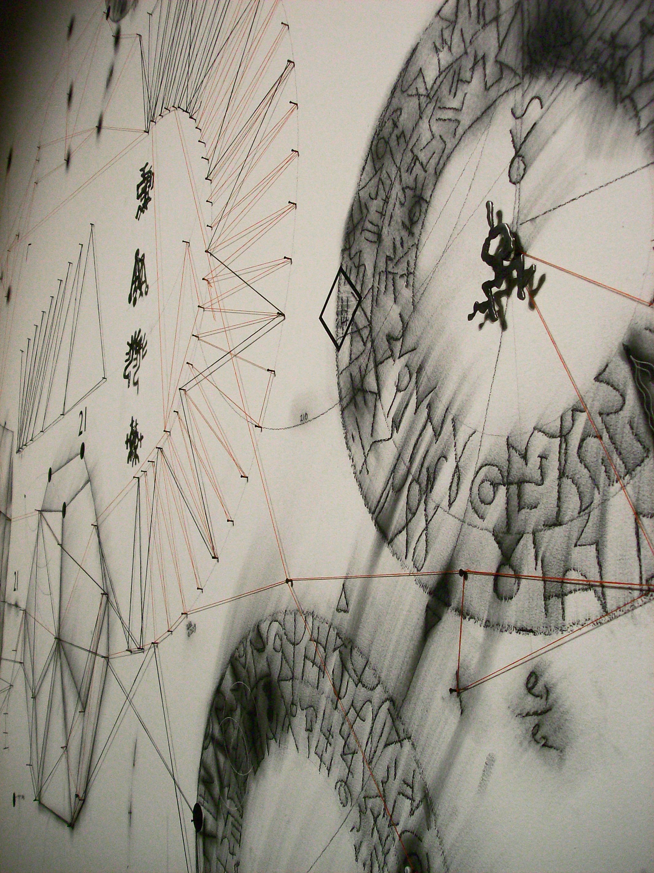
Line of Sight, Spokane, 2012
next show. There had been talk of somehow preserving the Art’s and Culture mural but I did not support that idea. The work was intended to be temporary and was absorbed precisely for what it was.
Scale is an Element
Even though scale is conceptual, it is an effective design element. Line and shape can be beheld, but scale is about adjustment. Scale also reflects so much more as life is scalar and the longevity of a work of art comes with a decaying or entropic collection of side effects. Scale may not be more than a concept, like time, but change is very real. We all want to live long and we want our children and our works to exist in perpetuity. And so it goes.
Yet not all scales of value are long. Scale can also be very short in time and point towards other existential ideas of being and space and erosion and size. Someone more clever than I once said ‘’the life span of a butterfly is exactly the right length.’’
One, to one point six one eight. The ratio remains though the scale may change.
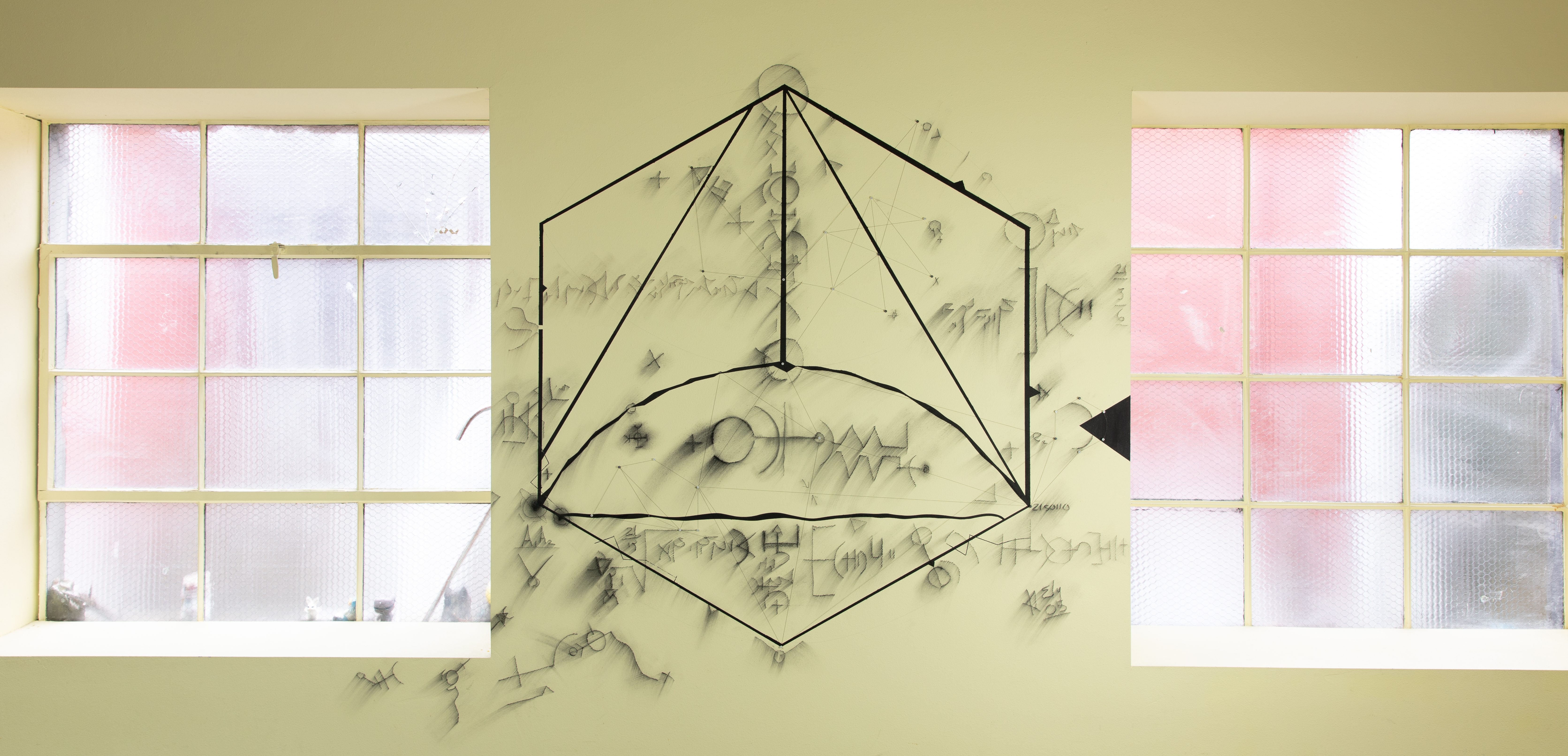
Atomic Direct, 2005
©2020 — Timothy C. Ely — All Rights Reserved

I was fortunate to see that Line of Sight exhibit in Spokane and it had a profound influence on me concerning how I viewed artist books. I find this discussion of scale so interesting and the points about scaling down remind me of the difference between making something like furniture for a doll house small and making it to scale. I see similarities in how one chooses materials to fit the scale of your project with the decisions I make working with textiles. All quite fascinating and enlightening, especially as I am now dabbling in some bookmaking myself and learning the basics.
LikeLike
Great insightful post! I’ve often thought that a miniature book that actually functioned like a real book would be the holy grail. You know, like it actually stayed closed because of accurate scaling, primarily the thickness of the paper and sewing supports. I bet the adhesives also matter quite a bit, since they are often way too strong for mini work.
LikeLike
Jeff! I am now remembering that one of David’s miniatures was also a scaled-down tongue& slot binding. The irony was not missed as it is a method [ as you know] for making large books with a the boards detached and installed as a last step. Making this small version was a formidable task. Next follow up post will provide more details. David was also fascinated by HO model railroading.
LikeLike
Pingback: Square Sequence Scarf/Shawl | Byopia Press
A jaw-dropping essay. Its content, form and length are so “to scale” that it is a work of art in itself. It also a useful touchpoint for any writer trying to express appreciation of a bookwork or an exhibition of bookworks. Many thanks!
LikeLike
Thank you for this! It was a good thing to think about
LikeLike