I have long been a fan of THE NEW BOOKBINDER, since its first issue with Roger Powell on the cover. The honor of writing a short essay for the journal, aside from being a humbling process of recollection, has garnered me some new friends.
Its nearly impossible to sum up large pieces of a lifetime’s work or even to describe the insights, tricks, sudden moves and revelations that one gets from working, talking with other binders, and, of course, following this Journal. My intention is to carry into the blog those parts that were a bit brief or just not really clear.
Here we reprint the article from THE NEW BOOKBINDER so as to spread the word and will irregularly follow up on methods and ideas. I say irregularly because other things often intrude.
If you do not subscribe to THE NEW BOOKBINDER, this is a chance! The organization promotes much of the best work and since its inception has been a platform for the evolution of the craft.
Timothy C. Ely, Wanderer at Large, Colfax, Wa 2024
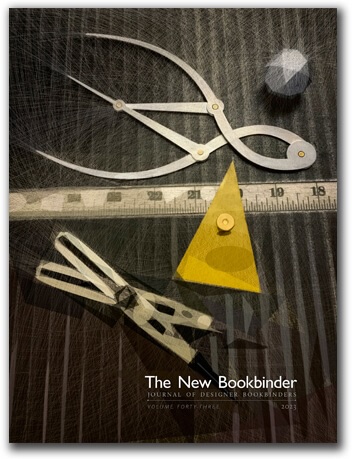
The following appeared in The New Bookbinder – Vol. 43 (2023). Copies may be purchased in the US through the San Francicso Center for the Book (SFCB) at this link.
My intention in this essay is to describe my process. The challenge, since all of this is wiggly and not sequential at all, is that it often backfires or stalls out or is so protean and powerful that it is difficult to nail down. Process, transformation, flow, creativity, and curiosity all appear to be components of a fluid, un-edged system. The fact that none of these components have a stand-alone existence, and you can’t buy a bit of any of them from your local shop, means to me that something profound is at play here. Transformation, as the primary term for this collection of concepts and processes, also seems to be a binary, oscillating construct, as transformation is an ongoing, never-ceasing result of thermodynamics (change is the only constant), while our creative impulses seem to come as bursts of inspiration (breathing) or the synaptic connections of constellations of dots—many, many dots, any of which might result in a new pivot or insight. What is evident, especially in hindsight as revealed by my sketchbooks that began in 1967, is that my approach to process is very malleable. All ideas and techniques will give way to mutation and modification (transformation!) if the work is not constrained by too many rules or concerns.
During my undergraduate years in the library at Western Washington University in Bellingham, Washington in the early 1970s, I sensed that my reading was revealing a somewhat secret science vital to making art objects. György Kepes, author of Language of Vision, and Jay Hambidge, who wrote The Elements of Dynamic Symmetry, in part about the golden section, were both proponents of proportional geometry and the linkage between many of the emerging technologies and their myriad overlaps. I felt that design had moved upward into a denser language and had been somehow grafted onto a larger inventory of revolutionary processes. At this time I was also inspired by Ed Ruscha’s book Every Building on the Sunset Strip and felt a static charge that somehow was very attractive. Duchamp’s boxes in valises also gave me a vital clue: books were contained sets of experience.
I have always made books of some kind, starting with staplers and lots of paper as a child, coupled with a vivid imagination. Derailed for a time by the more “regulation arts” of drawing, painting, and printmaking, book forms did not re-emerge into focus for me until about 1970. By then I had made my first etchings and was familiar with the variety of wonderful papers associated with the process. In looking at books about prints, I saw prints not only as individual works but also as illustrations in books. These connections were transformative in bringing me back to books.
That first decade of bookmaking was extremely experimental, which is the story when one doesn’t know how to do proper bookbinding. When I had the opportunity to learn bookbinding in England in 1982, I was already primed by British binding and some continental methodology gleaned from my own earlier research. The hands-on experience provided a high order of elegance and technique that I had been seeking. From there, my pursuit was to discover which parts of this new-found craftsmanship could be fused with my ideas of what I wanted to see.
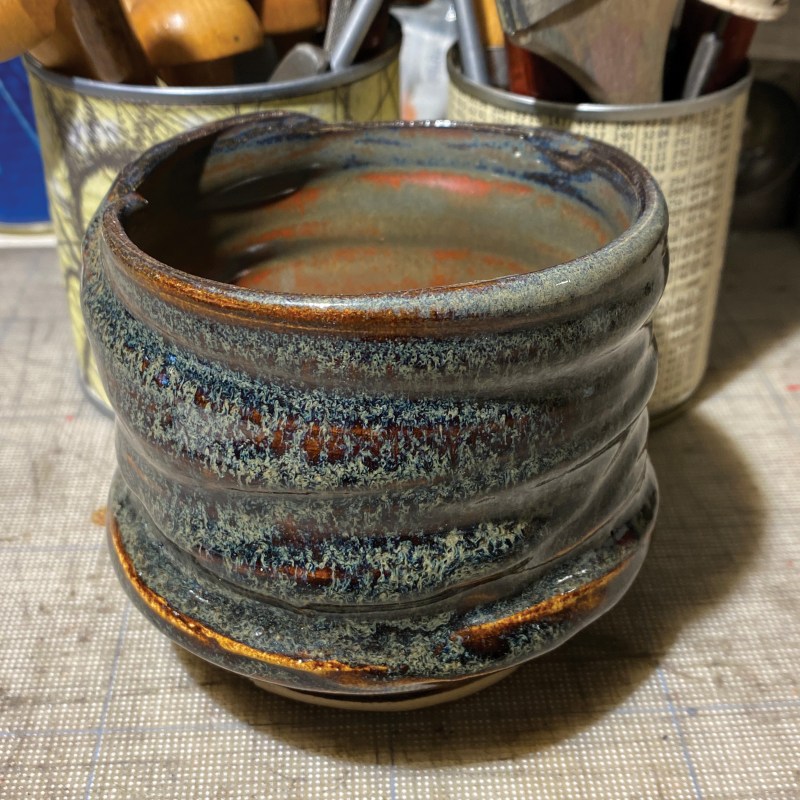
Fig 1. An example of the visual texture of inspirational Japanese ceramics.
This experience in England was powerful. Bernard Middleton seemed like an abstract painter to me with his treatments of paper and leather with materials outside the pages of the bookbinding supply catalogs. Gravy browning, stains, physical stresses, and weird graining tools, as well as skill so developed that his restoration bindings could look like replaced or forged work. He laughed about this with me. (I am a fan of skill high enough to stump the experts for a while.) David Sellars and others were exploring other applications in surface design. The more traditional binders were keeping the technical work from being lost and holding to an integrity of skill. It was all just so cool! I am fond of both innovation and tradition, each working to maintain a firm contribution. Tradition holds to a strong ethic, and innovation is that constant tug of chaos and complexity that channels traditional thinking into new and sometimes disturbing frontiers.
With confidence gained by my time in the UK, I moved to New York City and began exploring ideas about surface design that inspired me from Japanese tea bowls and other ceramic forms (Fig 1). How best could those surface notions be made to work on a leather covered book? Where would mutation lead to compromise?
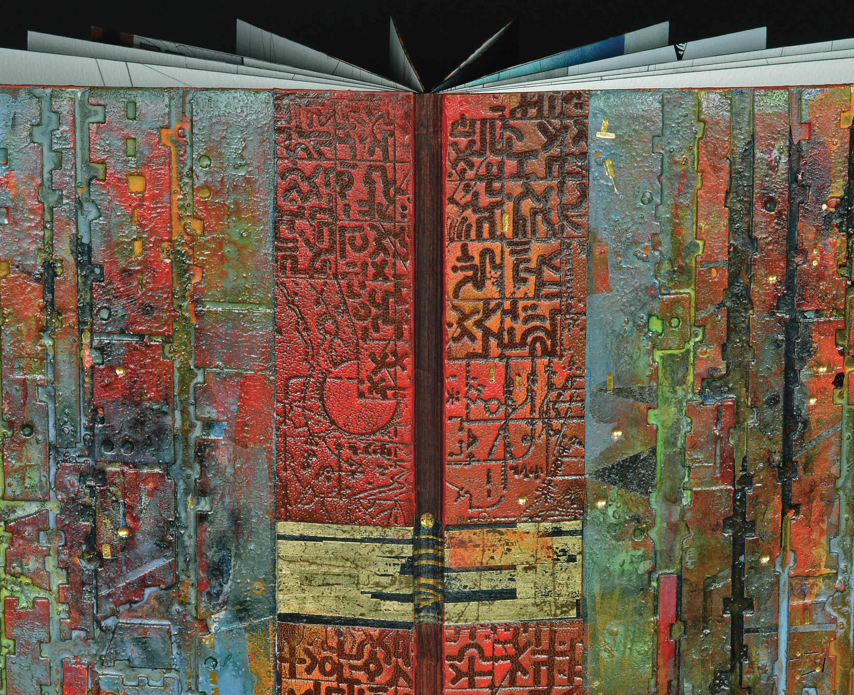
Fig 2. Cover detail of Hollow House showing surface treatments and color, with boards covering the spine material (In this case paper) up to the joints. Collection Getty Research Institute Library.
Arthur Johnson’s Manual of Bookbinding, page 197, illustrated a process called “how to cover a large book.” There were only a few paragraphs but in this was found a BIG answer. A near traditional method, with end bands and leather spine, Johnson’s method of a quarter binding with an outer layer of thin board covering the leather up to the joint was perfect. By hiding that edge of leather, I now had a full rectangle of raw space on which to build up bas-relief or depressions and attach all manner of devices, and in this process determine what worked and what did not. Onto this surface would be troweled a long list of materials, dusty things like paper bits or sand or other pulverized stony materials, graphite, carborundum or bits of thread as texture generators. Quickly it was found that a color charge in the gritty surface when glazed with a lighter color revealed the fissures on the boards (Fig 2). I had found the topographic method of both surface design and protection. A rock-like surface and the resins that adhere it all together get more solid or dense over time. They harden up and can make the boards quite resilient—bulletproof as they say.
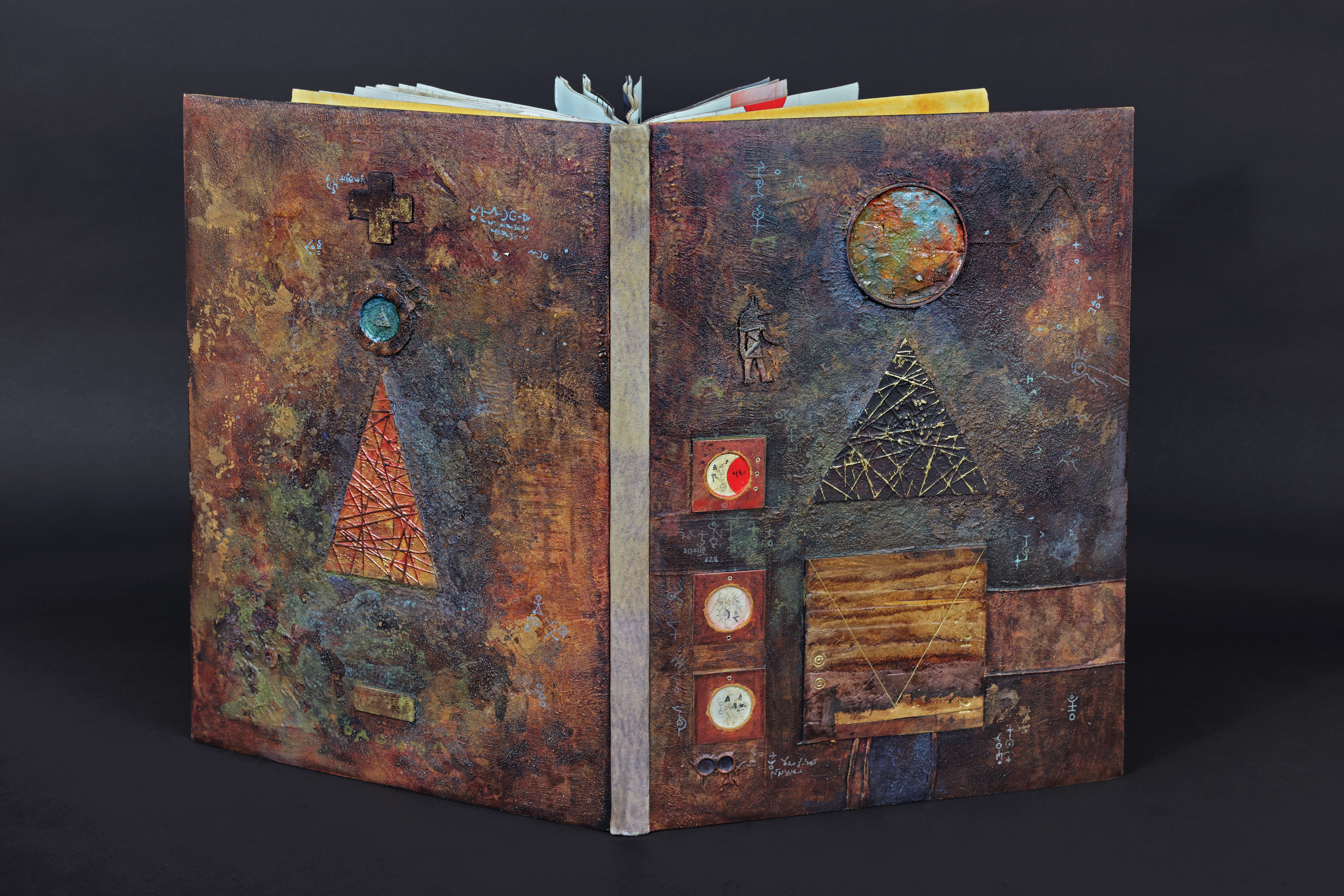
Fig 3. Cover of Flight Into Egypt: The Third Magnitude includes earth from various parts of Egypt. Collection of Letterform Archive.
My books are made of dust. As it was a simple matter to just use a few sources of sand or other aggregates, I felt that a conceptual connection was missing. It seemed that a book with an Egyptian motif might be well served by some material from Egypt itself (Fig 3). There is an occluded connective tissue here—a link to space and geography that is only evident when an observer of the book reads the colophon. Without reference or a degree in geology, sand is sand. But an explanation of the connection between place and material activates an entirely new context for the viewer of the book, and something special often emerges for them. I worked with this idea for about a decade until it was derailed by an entirely new assessment of the raw materials: I had access to machine shops and woodworking shops.
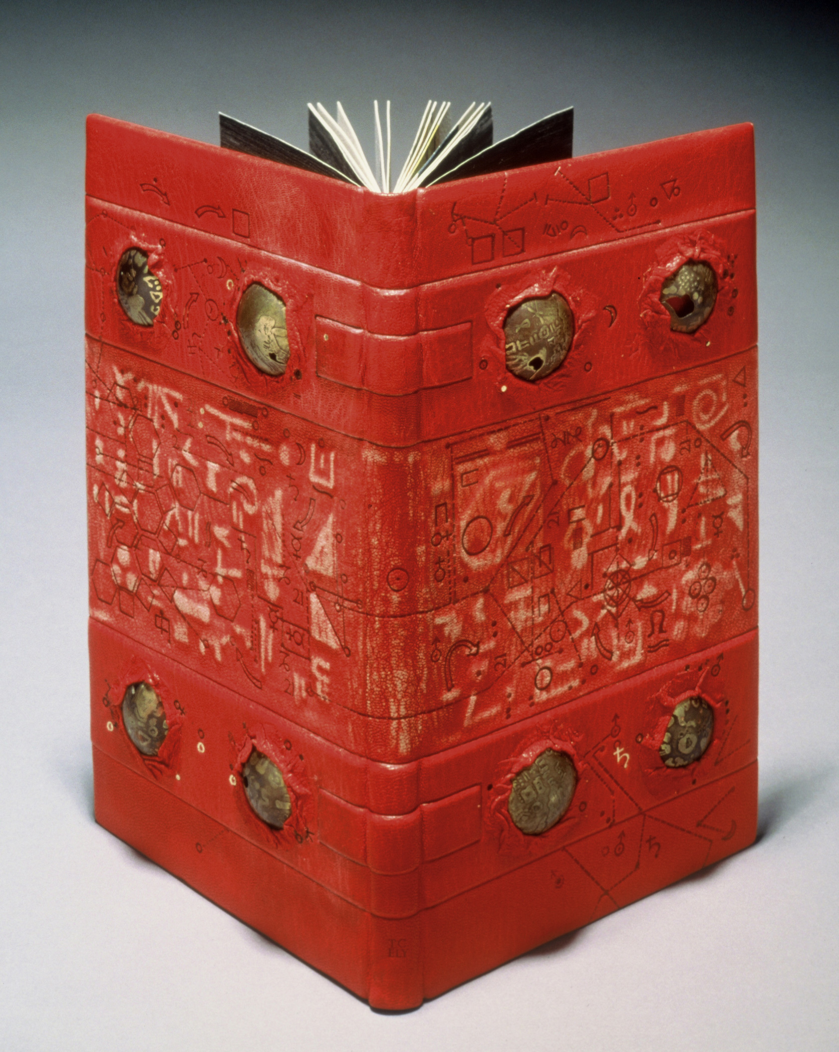
Fig 4. Movement and Path, a full leather binding with etched brass bosses. Collection of Victoria and Albert Museum.
Metals could be worked and turned into ornaments, finishing tools or even boards (Fig 4). They could be riveted together to extend the strangeness of my approach. Wood shops were even better. Exotic hardwood sawdust gave me a surface texture when mixed up with a batch of paste and wood glue. Unlike rocks and stone, this material mix was not hard on my knives and so could be manipulated in different ways. More and more my covers began to resemble collagraph printing plates. I wish I could have shown my professor, Glen Alps, the inventor of the collagraph process, one of my books. I know that he would have suggested printing one of the covers. I have since done this.
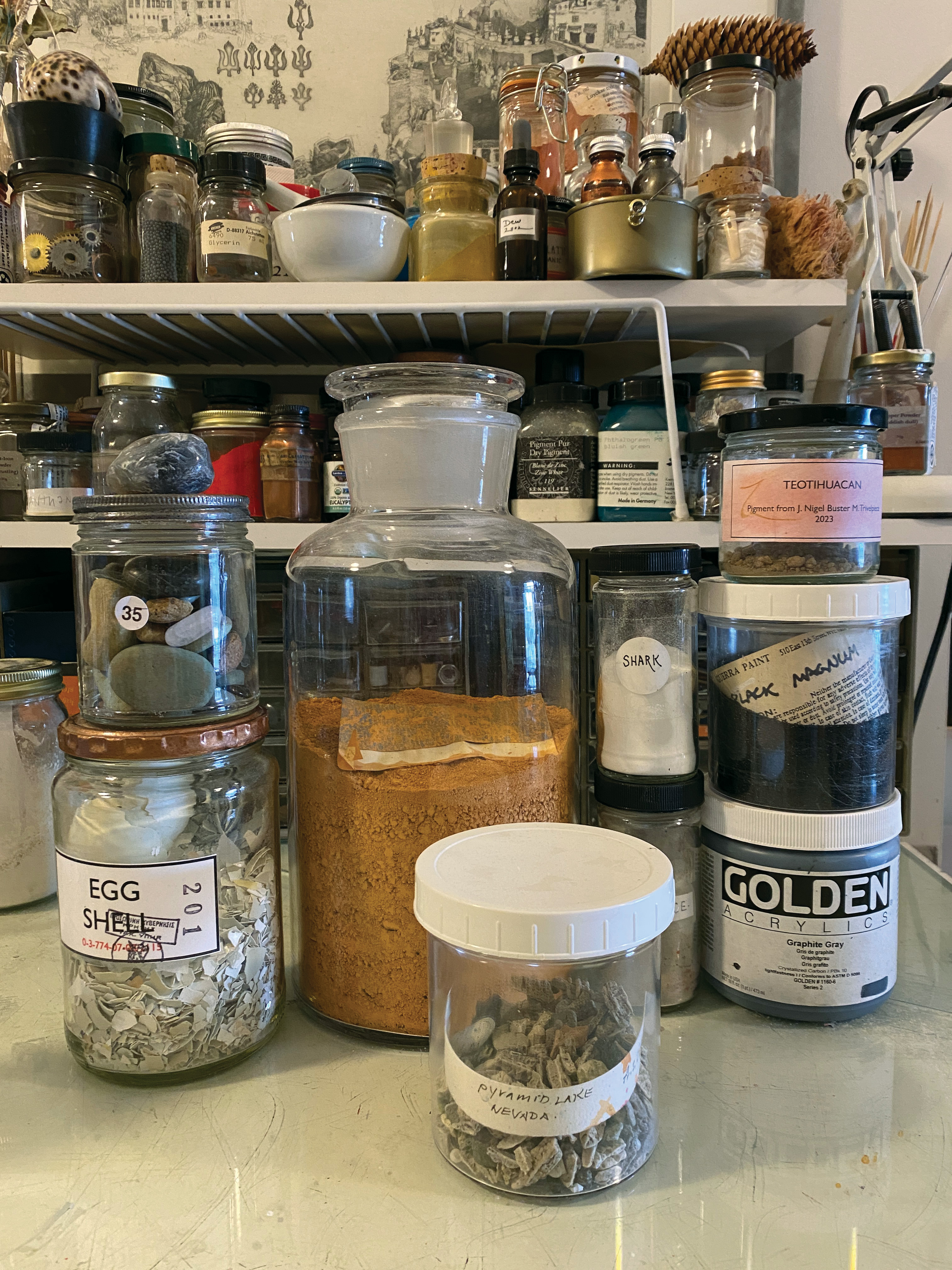
Fig 5. A variety of materials used for texture on covers.
More materials (Fig 5): egg shells, shellac, silicon, commercial pigments, found pigments, metal leaf, gold, silver, platinum and anodized brass and aluminum, holographic and solid color foils, transfer papers and carbon paper—a whole range of polymer mediums for specialist work; things like textile medium that does not change the feel of fabric when applied, to stiffeners that make fabric formable then quite rigid when dry; PVA and other acrylic painting mediums both matte and glossy, and various waxes. I have a box of butterflies and a box of opals.
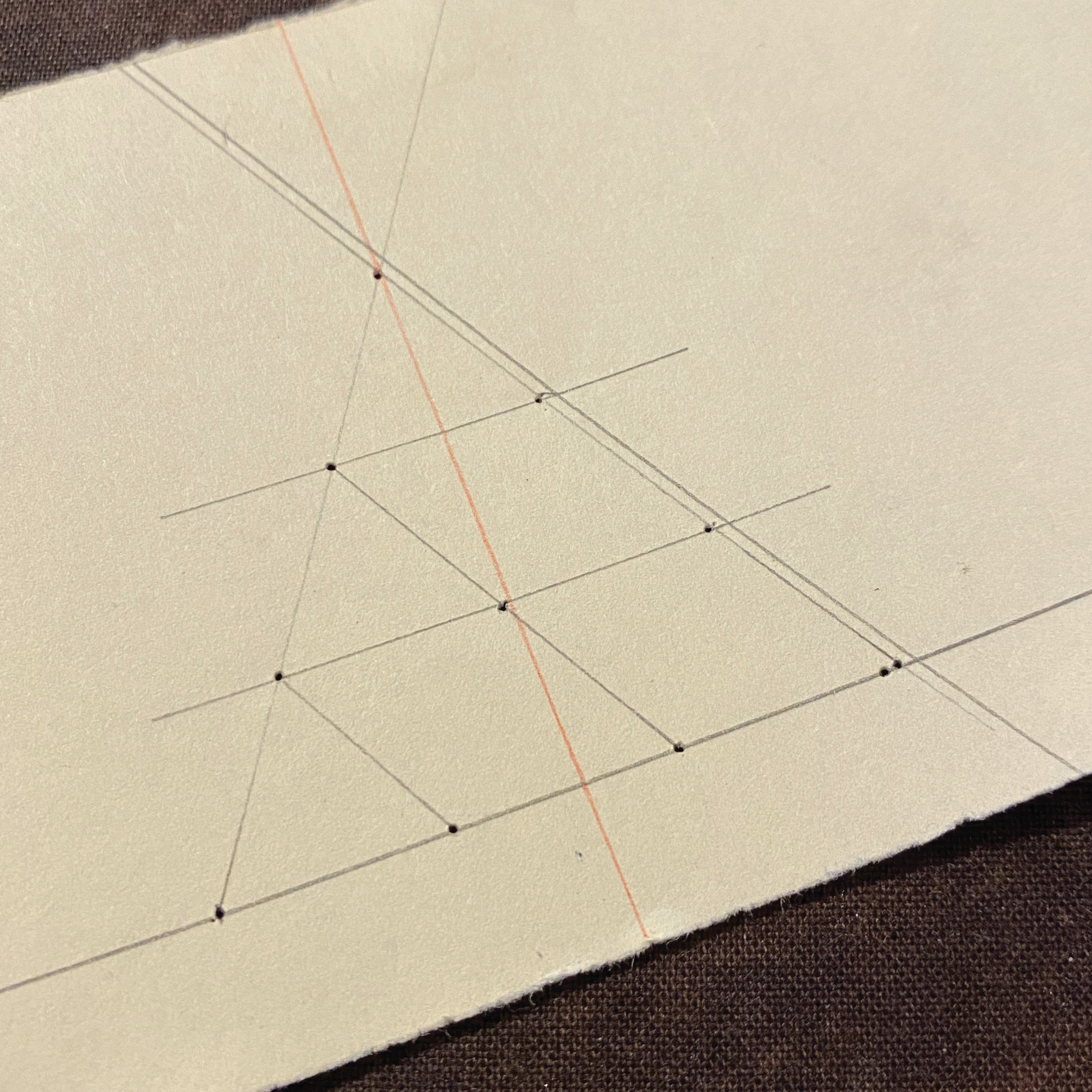
Fig 6. The paper template I made to establish compass points for the triangle of circles, top center of Fig 7.
Running parallel to the cover boards, the interiors of the books were getting a boost—punctuated equilibrium as the evolutionary biologists say. The art history in the museums I visited in the last decades along with a dive into the alternate reality of visionary architecture, pulled my images into a new degree of complexity. I love dense, packed visual space, the sort of area where you can look and wander as you do when looking at a map. All of this is connected. I was using a raft of practices of toning and sizing paper with gelatin and other materials to create surface. Toning and coloration with yard detritus and dyes and even oxidized metal sheets began to prime the paper with irregularities so that I was not starting my day by working on space in an undifferentiated universe. To further activate the drawing that was to follow, I punched holes large and small, made needle holes to accept compass points (Fig 6, 7), impregnated areas with wax or silicon to ward off water, stenciled dust and pigment, and resized the whole mess. It was, and is, beautiful. The surfaces were coming alive, yet subtle enough so as to function as underpainting. Elaborate drawing would take place on and within this submerged layer. In my sketchbooks I called the process “deep paper.”
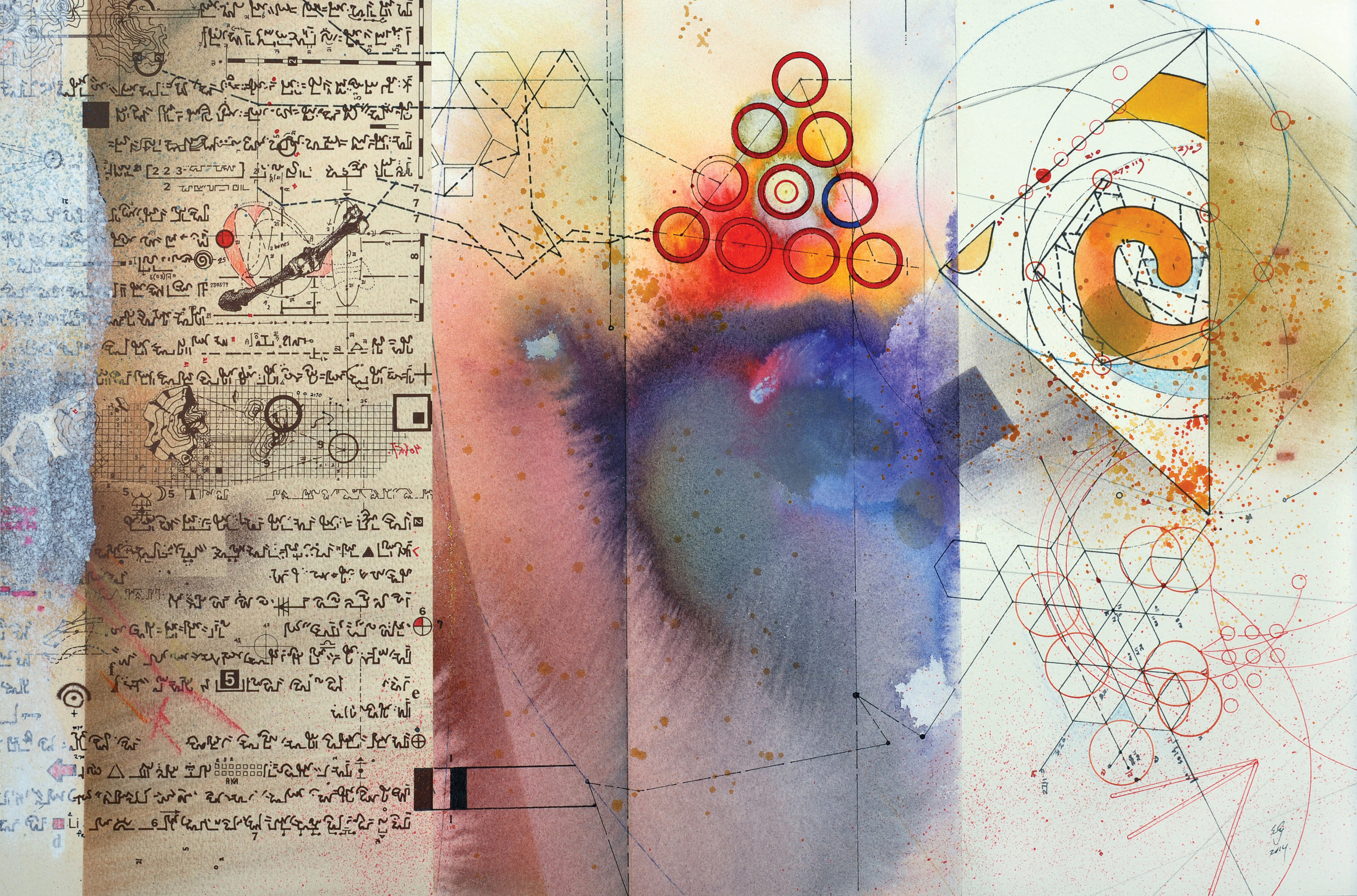
Fig 7. Impossible Landscapes 10, from a series of collage/drawings, showing a triangle of circles I positioned using the template in Fig 6 as a guide for the compass points by placing it on the back of the drawing and using a pin to mark the points. Collection of the artist.
Vintage and self-fabricated drafting tools are used to set up a system of webs on the folio, a framework where the overall conceptual syntax can be hung. This is done with ruling pens and diluted ink and graphite. Then follows the value development, which is a very standard set of rendering and gradation methods. This creates the tonal field and allows for a great deal of spontaneous handling of forms and materials. Lots of dust, lots of ink. It is now a process of unexpected transformation and change. Here the fun really starts as the book is taking on its shape.
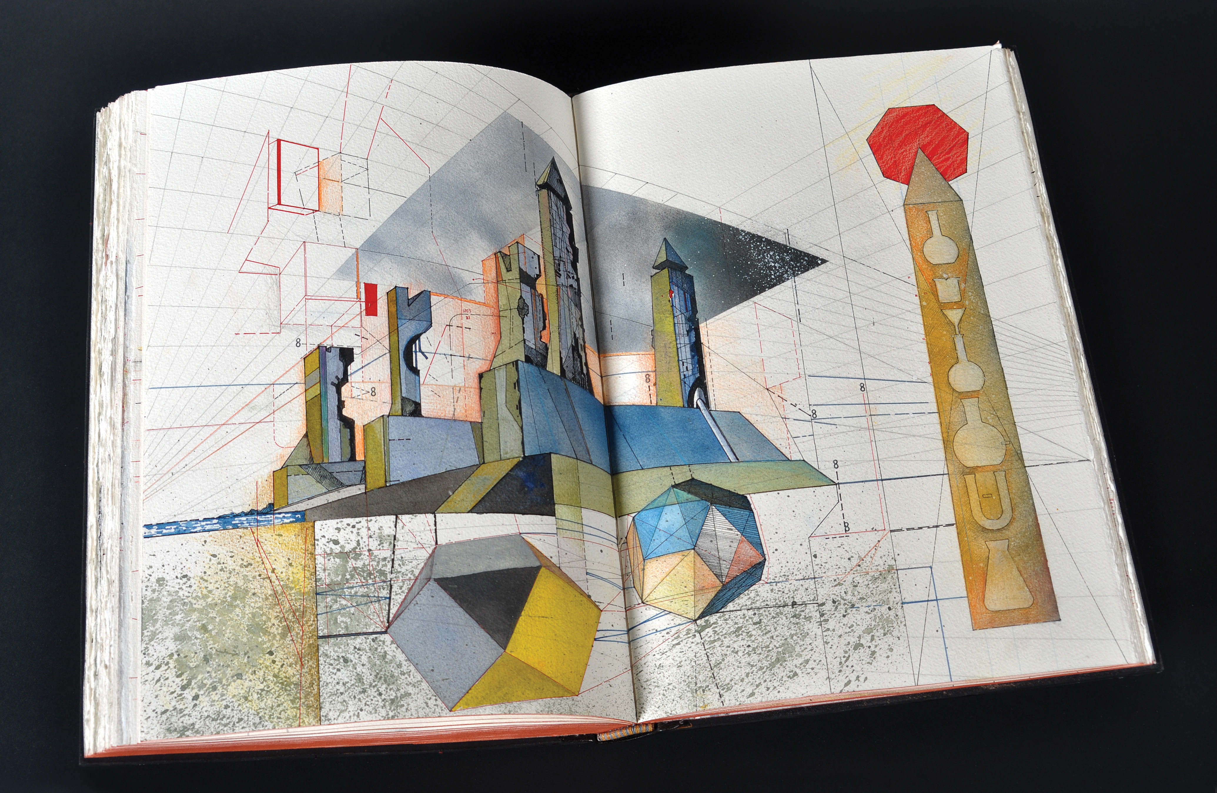
Fig 8. One interior drawing of 24 from the book Obelisk Stare showing a “horizon” line on which the drawing is grounded.
But first, everything has to start somewhere. For me, it is important for my drawing to be square to the fold of the folio, so my first move, no matter what is to follow, is to put a horizontal line on each folio, perpendicular to the fold. I use a large triangle set against the fold and draw that one line on all folios. It is either scored, so as to be a nearly invisible shadow, or a pencil line. These lines are the foundation for the folios. Every other drawing move grows away from this foundation mark. They might be submerged and fixed in the sizing IF that follows, but my process is so circular that except for the necessities of sequence in binding (end bands follow trimming for example) I might size or dye my folios well into the drawing process rather than at the beginning—a long way of saying these lines might be obvious or invisible in the final folio. As I was working on Obelisk Stare, images of which accompany this text, I began to realize that this line could correspond to what is known as the horizon line in standard perspective drawings (Fig 8).
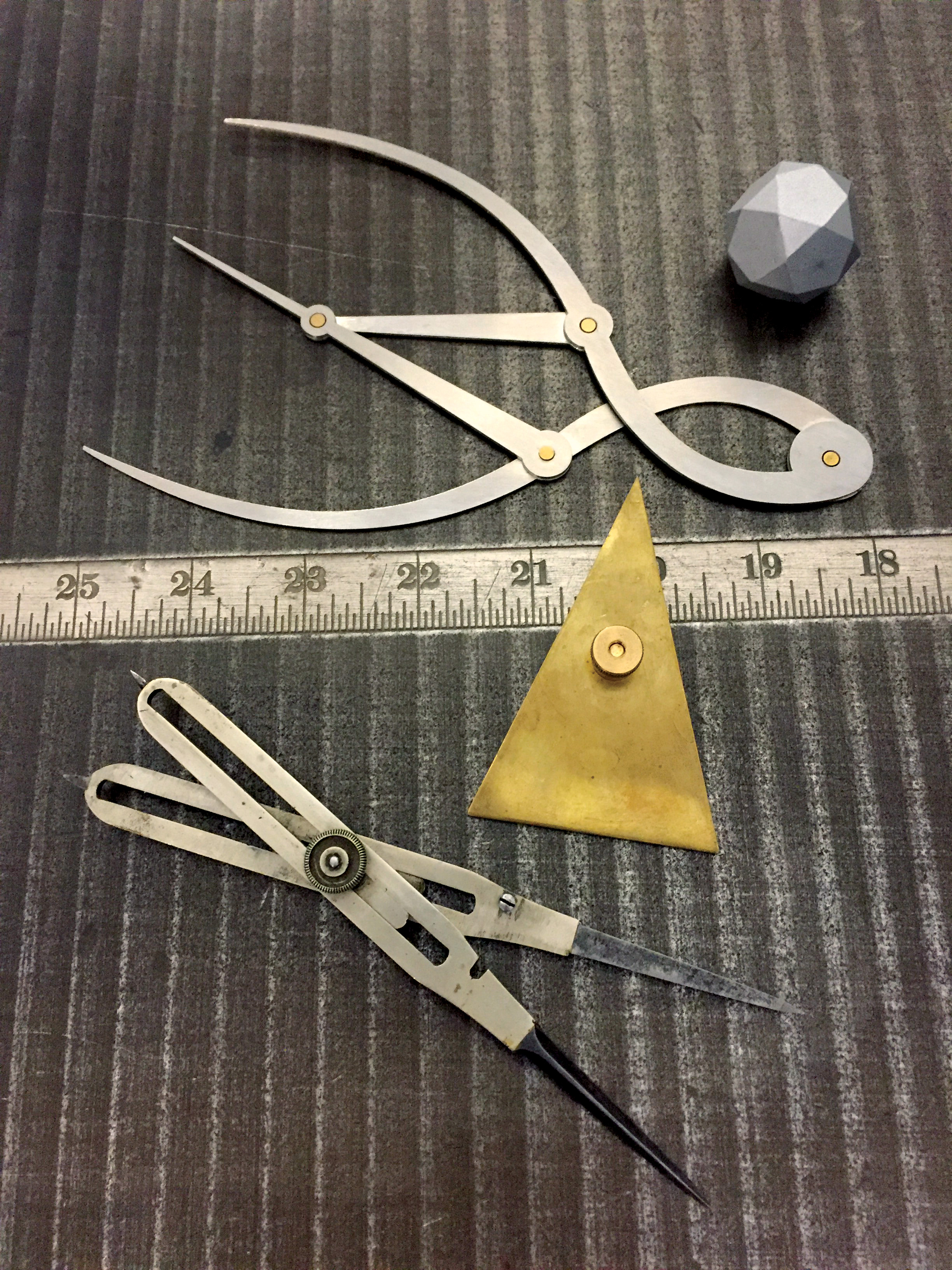
Fig 9. Favorite dividers I use frequently.
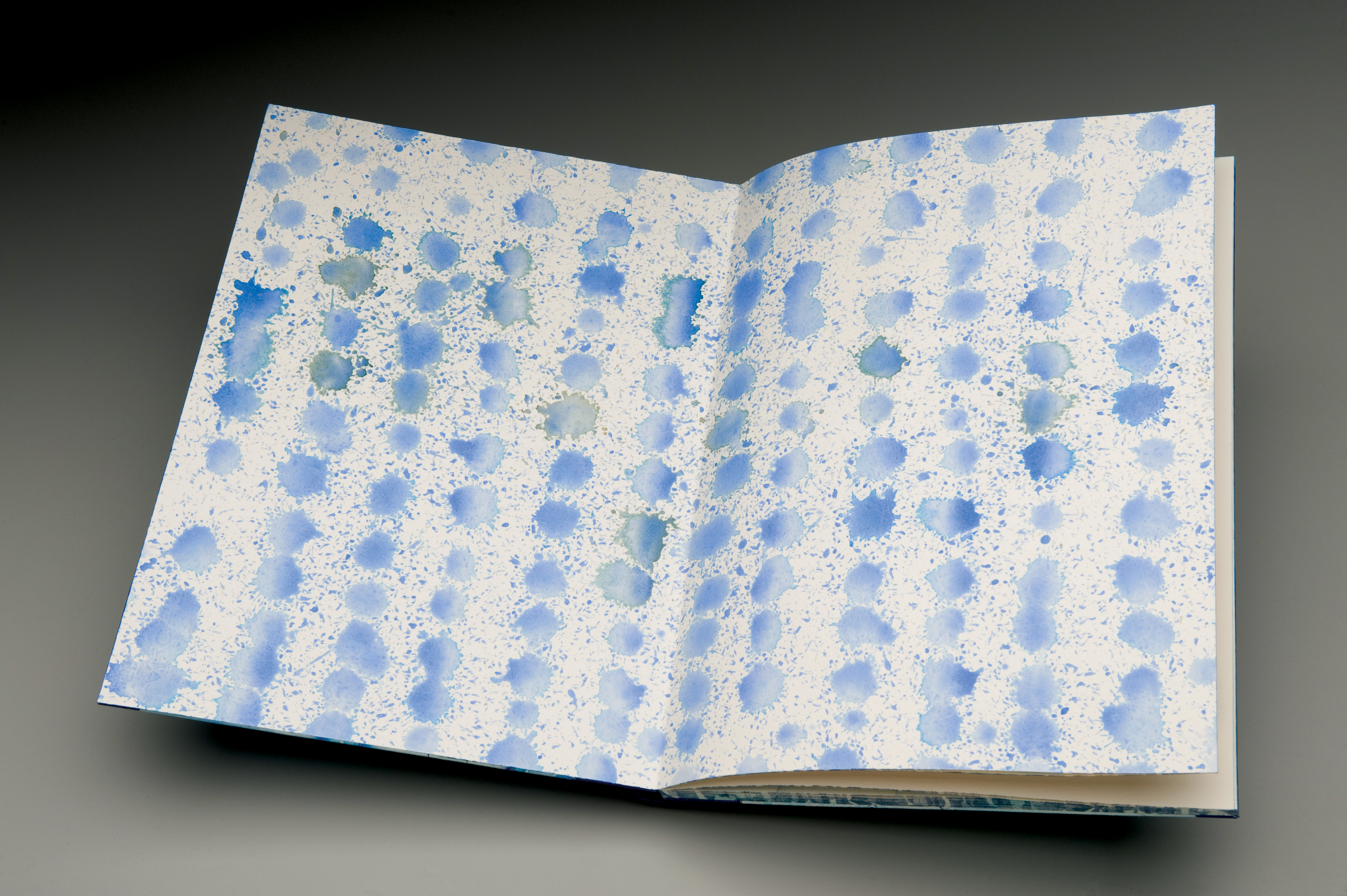
Fig 10. Endpapers that show the controlled grid of splatters I can achieve with the Dripatron, a series of small funnels evenly spaced in holes in a wooden bar suspended over the paper. I load the funnels with paint or ink and pass the paper at specific intervals under the bar as the drips fall. Secret Books of Natural Philosophy: Water in the collection of Lilly Library, Indiana University.
Vintage and self-fabricated drafting tools (Fig 9) are used to set up a system of webs on the folio, a framework where the overall conceptual syntax can be hung. This is done with ruling pens and diluted ink and graphite. Then follows the value development, which is a very standard set of rendering and gradation methods. This creates the tonal
field and allows for a great deal of spontaneous handling of forms and materials. Lots of dust, lots of ink. It is now a process of unexpected transformation and change. Here the fun really starts as the book is taking on its shape.
Fig 11. The pivot board I invented and built in order to generate radiating lines of all kinds. There are holes in the surface that accept push pins that I’ve put through holes in my French curves and rulers as shown in Fig 12.
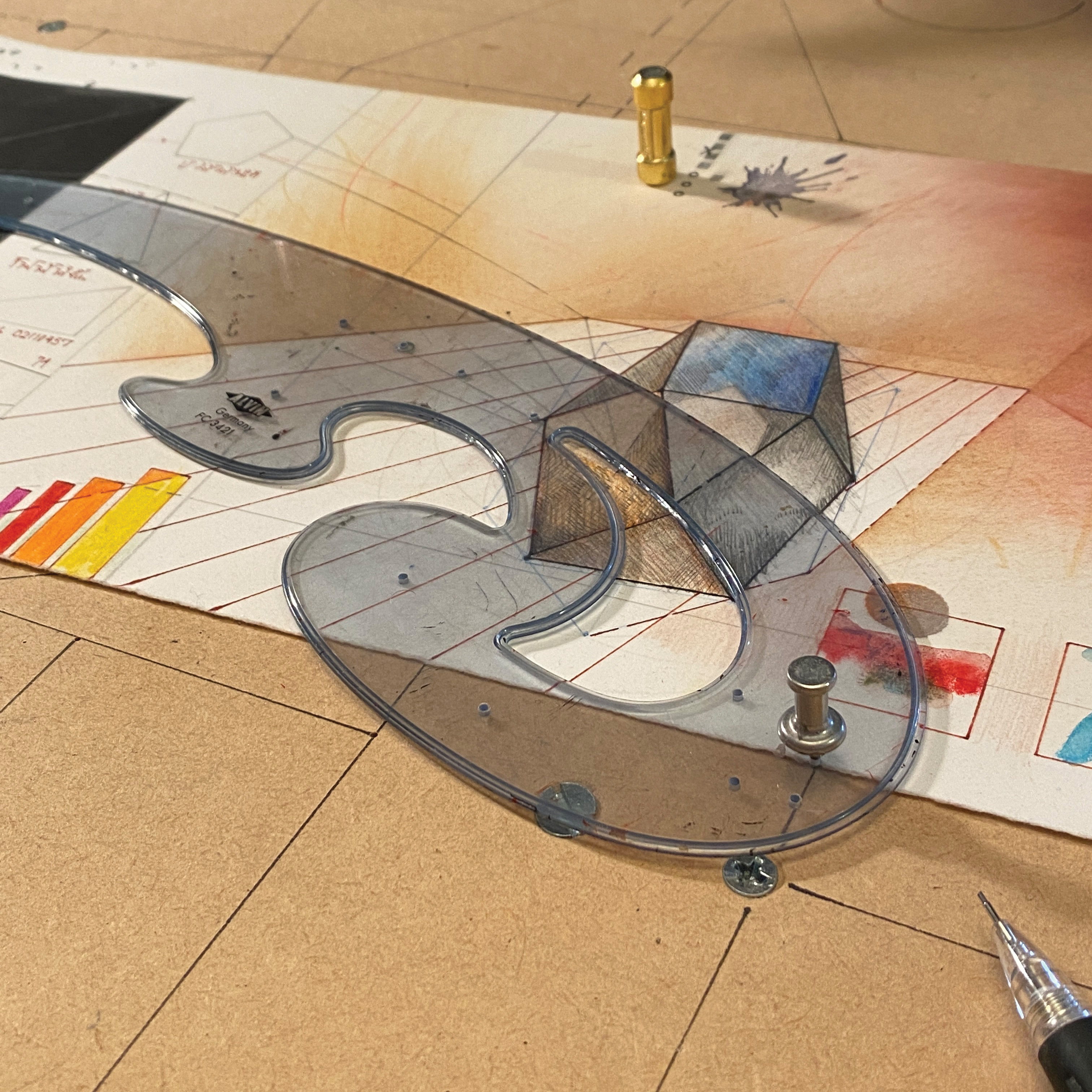
Fig 12. A French curve pinned and ready to generate a complex series of lines as shown in Fig 13.
Tools! Not only does my fascination with kitchen chemistry play a large role in my surface design work but tools and machines also contribute. In my studio and its satellites, the wood shops and machine shops, I have gathered or borrowed the machinery to make nearly anything I can think up. Foil stamping presses, drill presses, scroll saws, belt sander, rock tumblers for transforming stones into pigment, soldering irons, adapted soldering irons for tooling modular units, tacking irons, dry mount presses, Dripatron — my own design for delivering controlled splatters, pivot boards—another of my inventions (Fig 10, 11, 12, 13), folded pens, plastic spoons—a favorite paint/ink delivery method, drafting tools, measuring tools, magnetic surfaces, stencil burners, laser cutters, Work Sharp systems for keeping blades sharp, computers and other data devices as well as conventional machines like presses, board shear, and table saw. Books fill the interstitial spaces and my wife thinks I might be bricking us in with them to ward off the apocalypse. There are also lots of hammers.
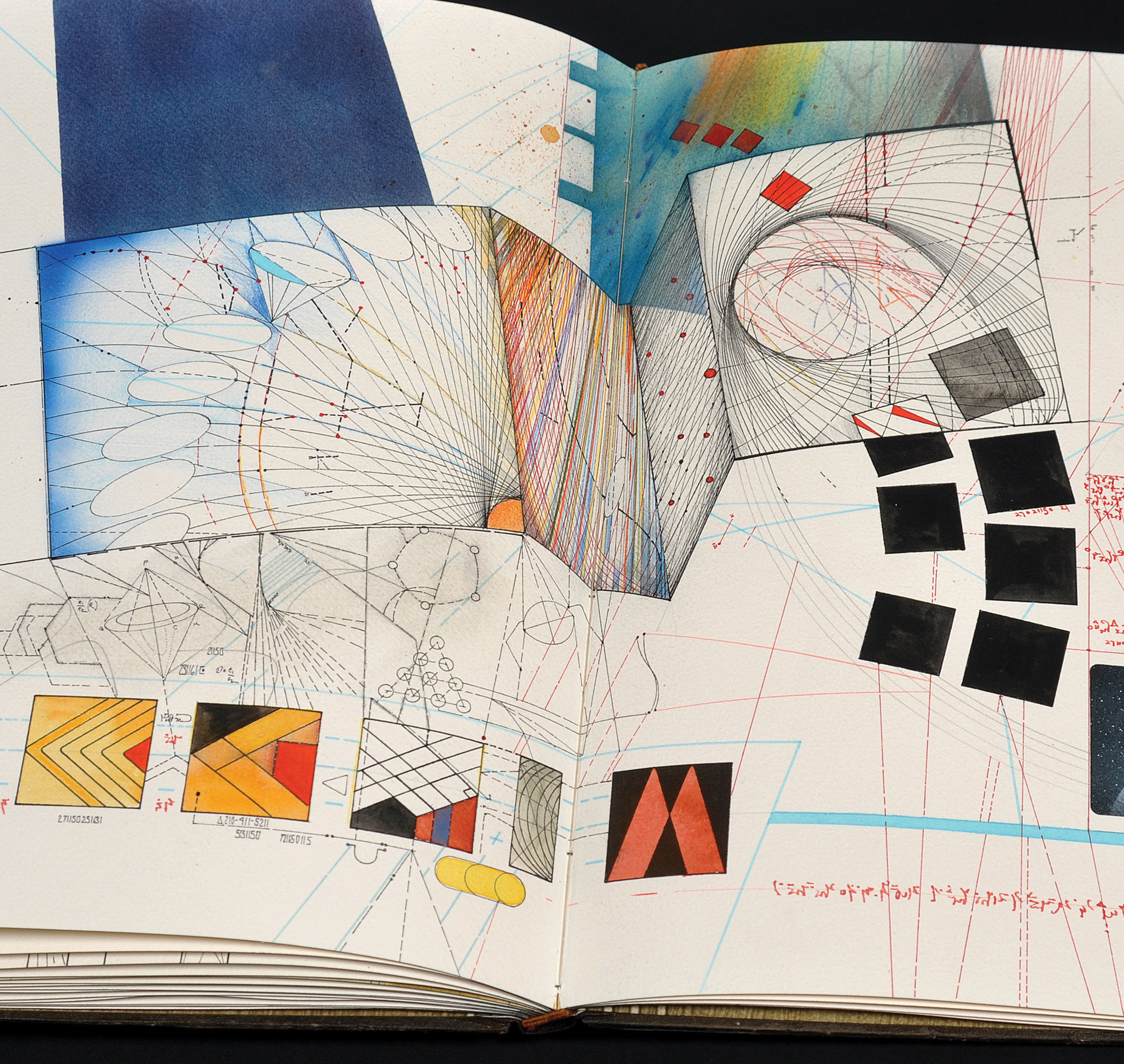
Fig 13. Detail from a spread in Zero 88 showing the complex line drawings that can be generated using my pivot board. Collection of Lilly Library, Indiana University.

Fig 14. Obelisk Stare cover with blind debossed leather spine, showing boards that come right to the joint. A good example of textures created by various means, along with depth of color that comes from many glazes of thin acrylic paint. Collection of the artist.
To visualize some of the ideas I’ve discussed here, I want to address one specific book, Obelisk Stare (Fig 14). This book was completed in 2016 and took about a year to draw. At the time of its fabrication, I was interested, as I frequently am, in the fundamentals of western perspective drawing and was reviewing my texts and making lots of sketches. London and New York both sport obelisks from Egypt in prominent locations, and I have visited and made drawings of both of them. I have always been intrigued with cast shadows and how conventional perspective renders the fall of light on an object, so the obelisk was a fine thing to explore. Obelisks are also objects of meditation, which seems appropriate when one takes months of quiet focus to bring an object to fruition.
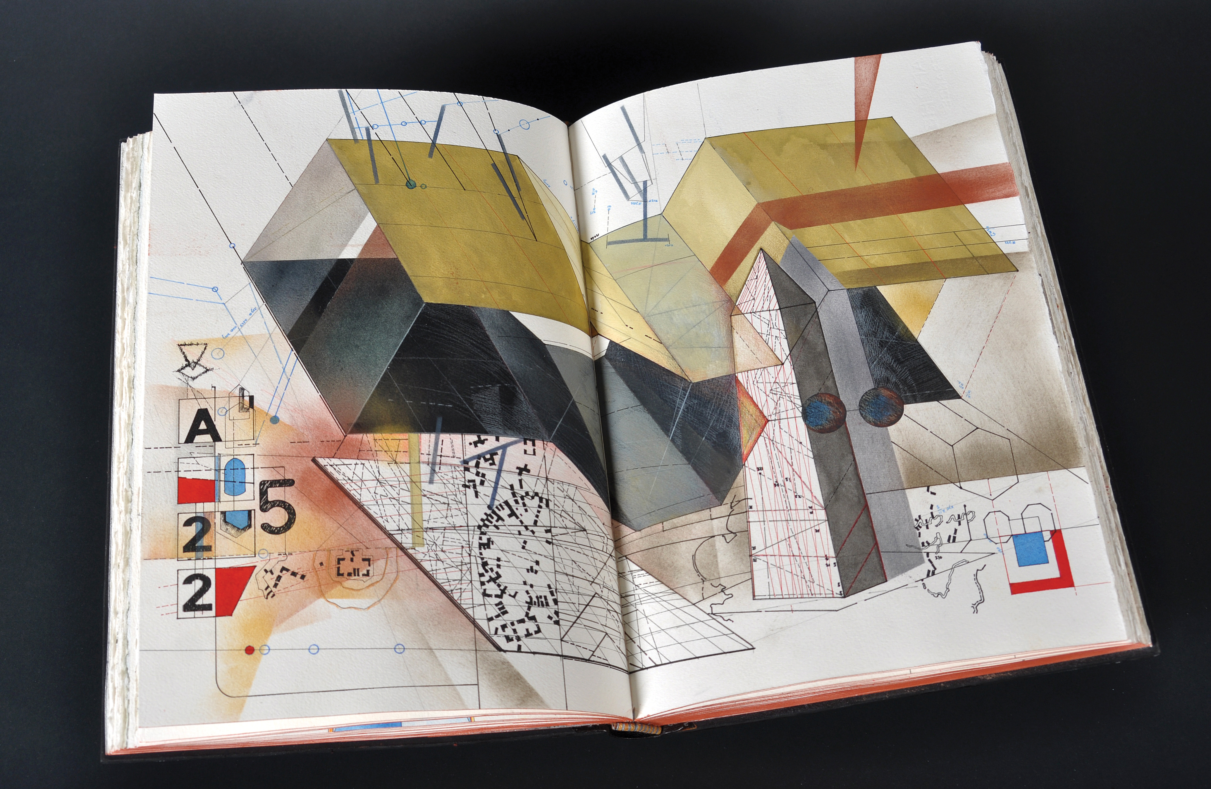
Fig 15. An example of the larger, complex drawings in Obelisk Stare that alternate with the smaller compositions as shown in Fig 16.
The book is made up of twenty folios (Fig 15). Each interior spread is a large dynamic drawing alternating on the back sides with small, linking compositions summing up ideas about the surface design of an obelisk (Fig 16). It is sewn onto five cords, slightly recessed. On larger books with heavy paper like this one, I sew the first three or four sections with a heavy thread and then switch over to a lighter gauge for the rest of the book, then return to the thicker thread for the last three. I find that this eases the section over when backing. Linings are light and sewn end bands are conventional. The leather for the spine is blind tooled both on and off the book before covering. The leather is brought down onto the first flyleaf and provides the board attachment.
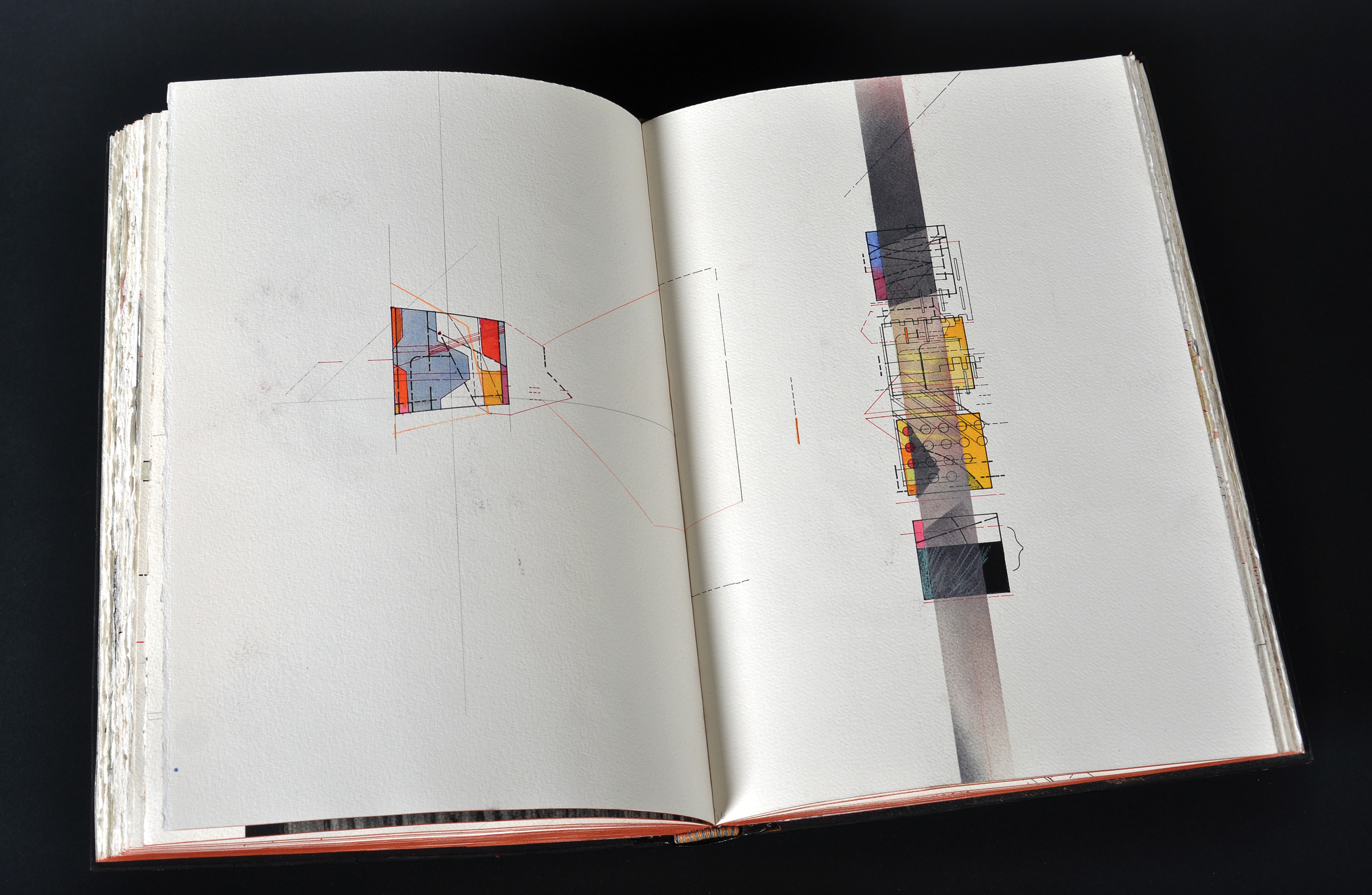
Fig 16. An example of the simpler drawings that alternate with the more complex ones, as shown in Fig 15, in Obelisk Stare.
The boards demonstrate many of the techniques I have described here. I made die-cut paper hexagons and used them to provide a matrix. Various threads, cords, gold foil, rivets, steel, and grids of plastic raspberry baskets join the visual dance (Fig 17). Because Egypt is generally thought of as a source for the obelisk idea, I employed sand from Egypt that was ground and tinted, then combined with polymer resins. Layer upon layer of pigment and acrylic paints make up the depth of color on the textured surface.
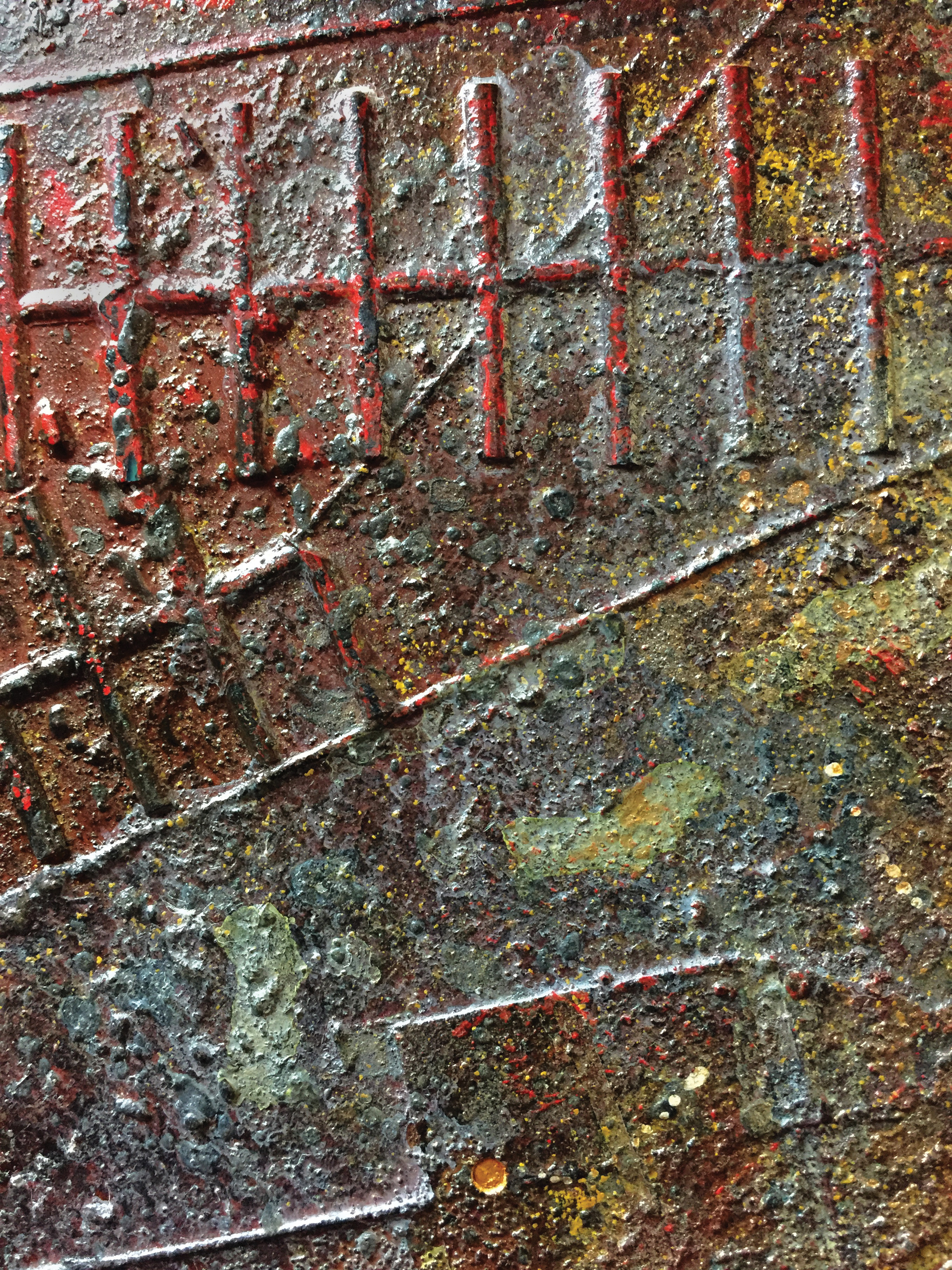
Fig. 17. Cover detail of Obelisk Stare that shows texture, color, and deconstructed plastic berry baskets.
In the end of all of this we confront the ineffable—that which cannot be spoken about. I find so many experiences, like concerts or exhibitions for example, naturally leave us with only the vaguest ability to describe them in words. Transformation is not a thing, but a process that’s ongoing. We are embedded in an ocean of possibility. Language, for all of its dexterity, has limitations and so we mumble on, and it is the best we have. We try to find words that might portray the enormity of what we experience and it often falls short. It is vital to remember that ‘’change is the only constant.’’ Towards that idea I offer up a continued elaboration. I plan to expand on some of this discussion in my blog, as well as suggest an email exchange if there are questions. You can also view a short video that features many of my processes called “Line of Sight.” Find the blog and contact info at aplanetarycollage.com—Hope to see you there.
©2024 — Timothy C. Ely — All Rights Reserved

I am so happy tho come across your post! I met Tim Ely at a handpapermaking studio decades ago!!
LikeLike