 It will be 50 years since Donn E. Trethewey told me that “if I wanted to be an artist, I would have to draw everyday.’’ That was on October 26, 1968. I was 19 years old going on 11. I have been lucky to have a friend in Donn since that time. He also told me about adding glycerine to my gouache to make it appear flat as if screen printed. Lovely. Between Don’s admonition and Imus’s assignment discussed in Part 1 (an assignment which never ended) I was charged with a task.
Drawing every day is not merely about entrenching learning as I discussed in my last post. Neither is it only about practicing to develop the connections of hand, eye, instinct, and mind.
To work in a sketchbook actualizes concepts and teaches materials — papers, inks, pencils, watercolors, and delivery systems for all these. In a sketchbook we learn how they interact and how they become critical in our finished work.
Chemistry and Friction
My sketchbooks, my fully developed manuscript books, as well as all my drawings share common ground in all materials. The materials used for marking — the generators of image, the drawing and painting materials — are often chemically astounding and important to explore.
There is a play, an ecology if you will, between the materials and the papers on which I work. Ecology is the understanding of consequences. One of the primary eco-dances here is the coefficient of friction between paper and what is dragged across the surface of a leaf in a book or a flat sheet magnetically held to the drawing board.

How do they react together? Does the ink bleed through to the other side? Is the surface rough, like being dragged behind a car? Is the paper seemingly repellent to the damp mediums? Does dry pigment stick? Is the paper so smooth that dusty things like pastel can’t get a finger hold? Is the paper too thin to accept the work? Is it too rough to generate the image I want? How does it react to wet applications? The connective issues to explore are many.
Ink
In 1973, as graduate school was starting, I was having coffee in one of the many watering holes around the art building. I was joined by some eager fellow and the next thing I knew his coffee was all over my sketchbook. Not much harm was done but it led me to commit vigorously to a new rule: all inks would be of the India ink variety — not soluble or at least as water resistant as possible. (I would not begin using a China ink in the sketchbooks for about 20 years, the trauma of dampness was so solidly imprinted.

My first technical pen. I still use it.
Earlier still, with the first assignments began my engagement with inks and delivery systems (pens, brushes, plumes, pieces of weeds…). Inks matter as do the delivery devices, especially for the mobility of the sketchbook.
What can you carry that is venerable like a fountain pen and won’t leak if you are scaling a wall? My favorite ink systems are old technical pens. I received my first one as a birthday gift in high school after seeing that a friend had one. We both liked 00 as a size but I have now moved up to a size 0 for most work. The old ones, fountain pen style, have a weight that is fine and the old points, when still serviceable are better than replacements available this century.

Schemes of Ink
The sketchbooks I kept in grad school led to my work entitled ‘’Strange Wings or Over the Nooksack Valley’’ — a two-volume book set which might have formally turned me into a bookmaker. This work was created in two commercial books which were made up of a satisfactory paper.
Part of it’s genesis came when, while working from Thompson’s THE PRACTICE OF TEMPERA PAINTING, I came upon the presented idea that one could establish a value schematic similar to that of tempera painting all in dilutions of India ink.
There is a wonderful unfinished Dürer in the Metropolitan Museum of Art that deftly demonstrates this idea. The painting was basically drawn or rendered fully in dilutions of ink. The ink then, being relatively insoluble, allowed the image to be colored up in egg tempera which was laid in as thin flats and, in some works, further rendered in oil. It was a beguiling idea to completely render a work, then essentially color it in. I liked even better though, the idea of rendering in dilutions of ink.

This technical breakthrough was, for me, astounding. I began to fill my technical pens with a dilution of ink and distilled water. Each time one line crossed another line, the value toward darkness would increase. My robotic flyers in The Nooksack Valley books were drawn with these veils of inky gray. (The Nooksack Valley was the site of a conceptual visitation from aliens in a short story I was working on.)
The Nooksack books proved difficult to photograph because my exploration with ink values in sketchbooks had led me to create something delicate and delirious. That my aliens were difficult to photograph is a tremendously weird idea. Yet these drawings simply would not have worked as completely black ink drawings.
During this period, working in sketchbooks led to my becoming aware of the unique folio-to-eye relationship. Amid a world where trends drove artists to create massive objects, the scale I favored was intimate. Books are not read from across the room — they are private and deeply personal spaces.
I currently dilute ink into lovely old Schaffer Ink bottles and label them in order of Magnitude — five is almost black and one is very faint, almost a watermark or blister on the page.

Dilutions of Ink on Studio Shelf
Dynamic Sketchbook
The mobility of the sketchbook brings a different dynamic into play. The folios of one of my manuscript books are most often worked in the studio but the sketchbooks go into the world.
Folios.
Out in the world I carry many more portable tools — beloved technical pens filled with dilutions of India ink and others filled with soluble Noodler’s ink, the bulletproof variety. I thin the Noodler’s with a bit with water as it tends to thicken if my discipline goes south and I slack off some. Pens need the dance of activity to keep the fluids moving.

Beyond pens, I carry mostly dry tools and instruments, while markers are rarely used for they look thin and reedy and can bleed unceremoniously onto the next page. Colored pencils and chalks of various sorts work well and a piece of wax paper can function as a portable fixer. I carry a few templates, rulers and always a straight edge and compass. (Never know when I might have to help build a cathedral.)
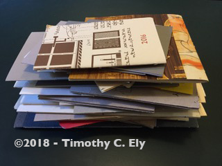
My practice is to work in bound sketchbooks. As a way of expanding the game, I also carry single folios sewn into file folders for protection so I can work on these folios outside of the book and in antecedent to them. In other words, to make a sketchbook that is not a book — yet.
Sketchbook Number 76
At some point there is enough jazz in these ‘’folio starts’’ to then assemble them into the next book. It is a method of working laterally. The folios are initially gathered, marked up for later sewing and the sewing stations sawn or cut into the folios. This establishes registration for later and also those cuts attract a drafting triangle and may get a pencil line perpendicular to the fold which might attach itself to an illustration…or something. If the game gets strange, it’s a very good thing.
Needs are Simple, the Result Magnificent
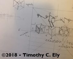
The next move was to ramp up the noise level of “strangeness.” I needed this to take the sketchbooks and the work they were generating to a new place — something had to grow. Growth happens illogically but arrives vividly as ideas often do. The efforts toward an expanded context started to make their way into the sketchbooks when I first drew a radio circuit in the mid 80s. Irrelevant to bookbinding, yet not…. I was looking to bring more varied kinds of descriptive projections into my drawings and to allow the recent paper changes to support these projection techniques [isometric and oblique to name only two that interest me] and to push forward the drawings themselves… to draw more!
 This circuit drawing, worked from a popular science magazine, opened a window to this enhanced role for the sketchbooks. It helped me get away from the conservative traditional role of the device. I might also have been recalling a favorite Walter Miller book, A CANTICLE FOR LEIBOWITZ1, so other things began to show up — circuits, Greek vases, insects and other image visitations which function as the Muse. The sketchbooks were once viewed as a parallel operation and secondary to other things. Now, no longer taken for granted, they were moved to the front of the line. The ecology of the manuscript book and the sketchbook became co-equal in their supportive function of my work.
In all, the needs are simple and basic — figure out what you want to see. Figure out what to use. Figure out how to do this. Knowing what the materials or concepts are about is a beginning. Knowing physical materials is half the equation while the metaphysical content — the projections of idea onto paper — the other.

Purely interacting with materials as an end can become something that impedes the discipline because of the size of the possible inventory. And, so, it’s important to take some time and get to relying on sketchbooks. Use that time to learn to whittle those materials into a working set of instruments and means.
This is Part 2 of a multi-part series about relying on sketchbooks. Part 1 can be found here.
1 The book “A Canticle for Liebowitz” is set in the period following an atomic war. In the first part, Brother Gerard (I believe) is copying a holy relic of his order. The relic is detritus of a former world — a fragment of a blueprint, a cyanotype of the commercial sort which is signed by Leibowitz. The holy order considered Leibowitz a saint. So Gerard works with good intention but sometimes wonders why the drawing was made more difficult to copy — because all the white lines have to be painted with a blue surrounding them. I am fond of this kind of error. Wikipedia summary here.

Gamma Cruxis
© 2018 – Timothy C. Ely – All Rights Reserved

Pingback: Friday Night Flicks: TX83-Timothy C. Ely | Byopia Press